4 Styles, 1 Portrait
Challenge:
Mimic the style of other games, entertainment, and art forms
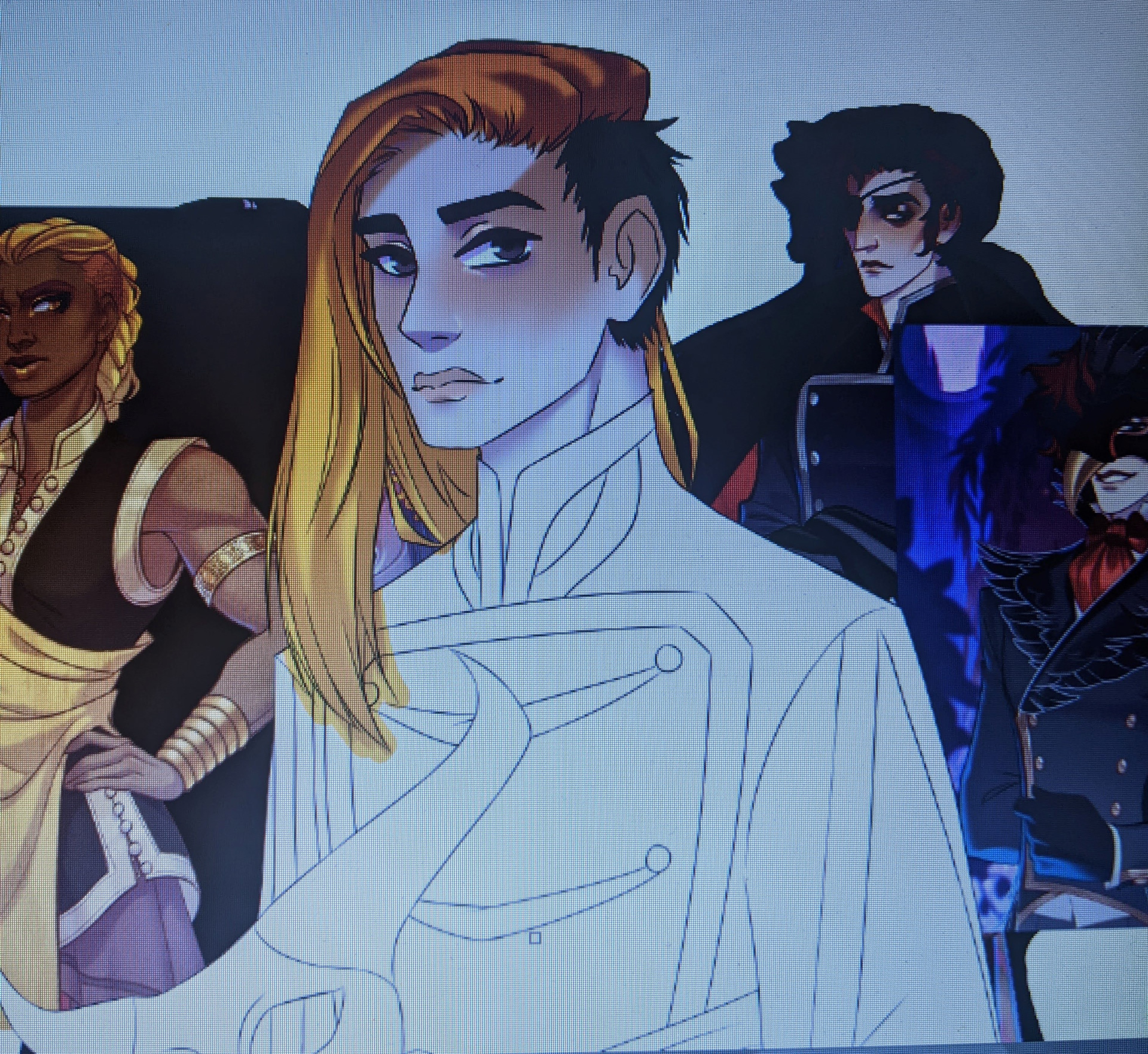
The number of reference images I had was staggering...
As someone who comes from a family of nerds and geeks, it really shouldn't be a surprise that I was raised on anime. I've continued to consume the Japanese art form to this day, of course, and there are some animes out there now that have some stunning styles, including my current favorites, Demon Slayer, My Hero Academia, and Jujitsu Kaisen. I also enjoy trying out new art styles, so of course I had to try my hand at a few of these. I chose from a variety of categories, however, not limiting myself to just anime styles, since that is fairly close to my personal art style already. So I settled on four styles: Demon Slayers, My Hero Academia, The Arcana (a mobile game with fantastic graphics), and a stained glass window, like something you might see in a church.
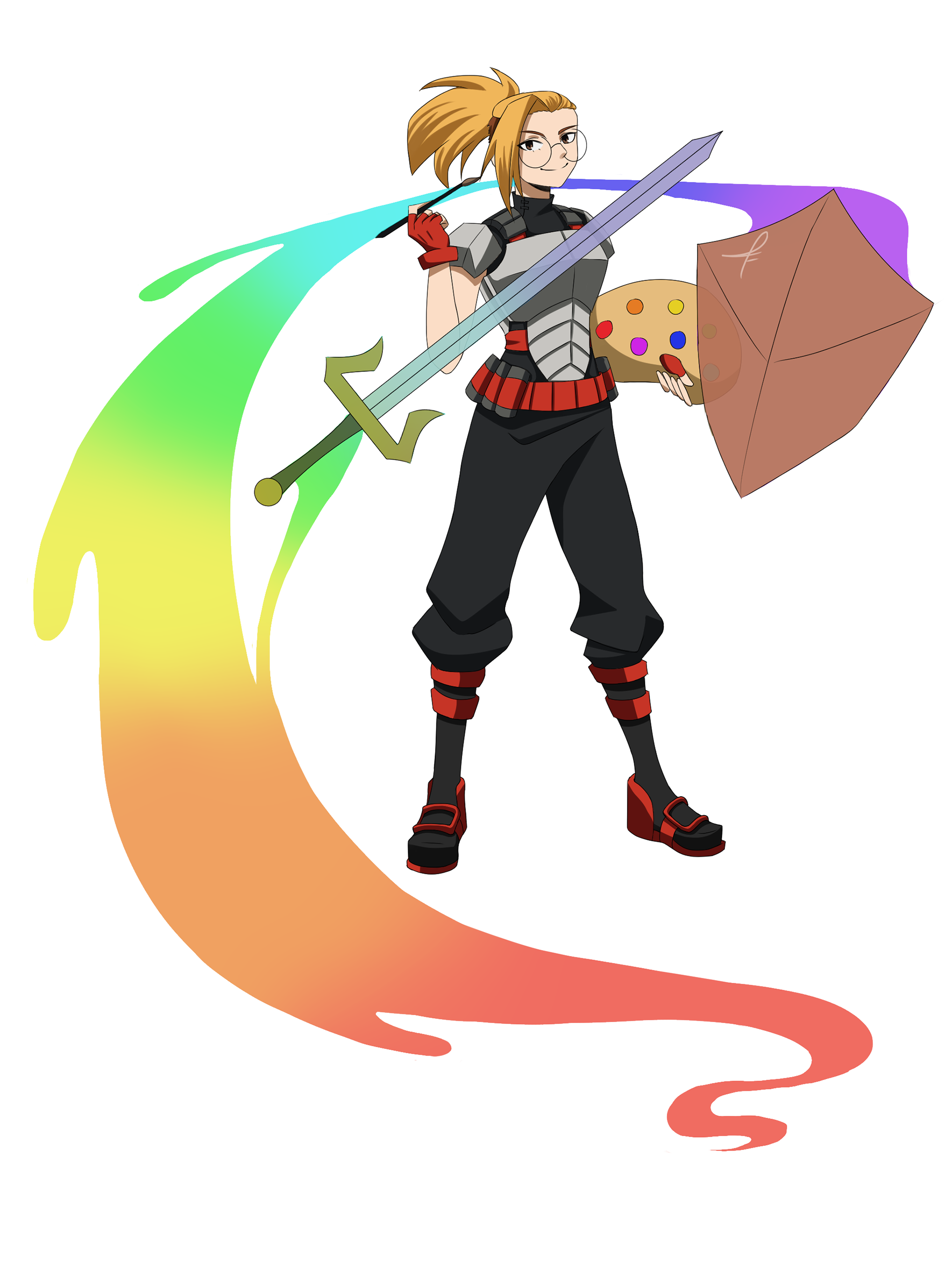
What's mightier than a sword? A paintbrush that MAKES a sword.
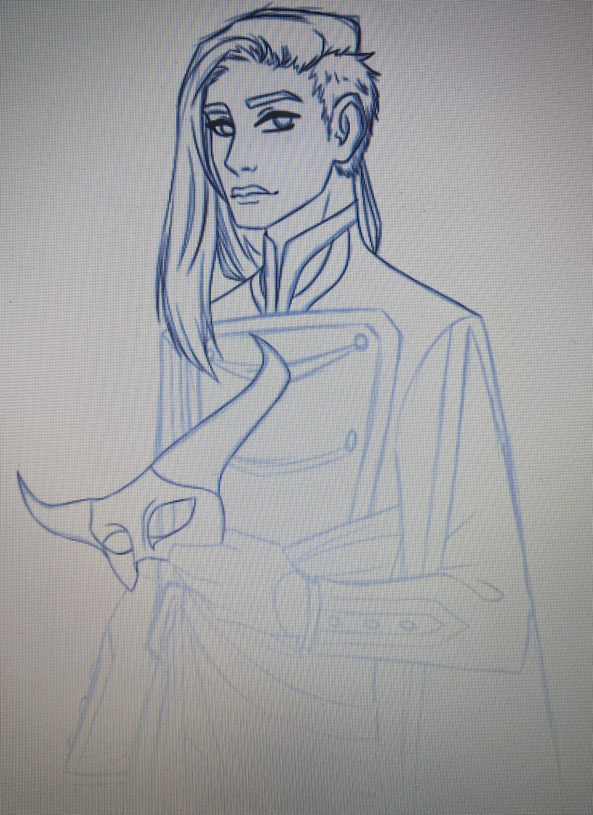
Up first was My Hero Academia. I started by gathering reference material, finding a pose from one character, a face from another, so on and so forth. I analyzed how cloth was shaded, how armor was drawn, and eventually started sketching, taking small details from various characters in the show that I liked or fit the most.
The result was an amalgamation of about half of Class 1-A, but I liked it enough to make it digital and add color, which is when it really started to look like I was part of the show.
Bakugo and Kirishima contributed the most to this insert.
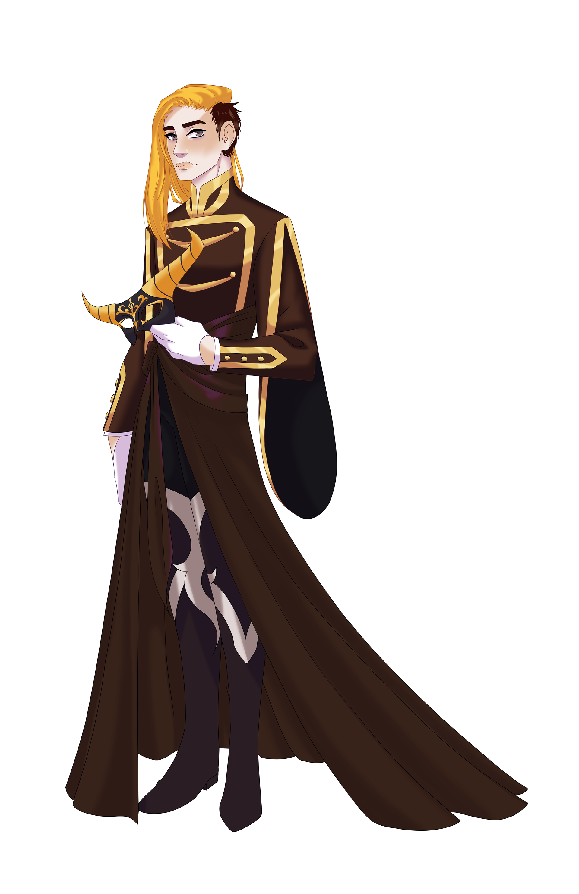
Next, I started working on the mobile game The Arcana. This game has a much softer, more painted style than what I'm used to, so I struggled a bit with this one. There isn't many hard edges, and nearly every shadow or color is blended in, but by the time I finished, I ended up liking it so much that I started using the same blending technique on my personal style as well.
Same as with the My Hero insert, I gathered all the references I could find and started sketching, pulling details from character to character. This style is a little more realistic than the Japanese anime is, so it was an interesting time trying to match my features to a fictional character's, but by the end, I fit in just fine.
There was one character that was pale enough to match my vampiric tone, and I pulled up a lot of references of him.
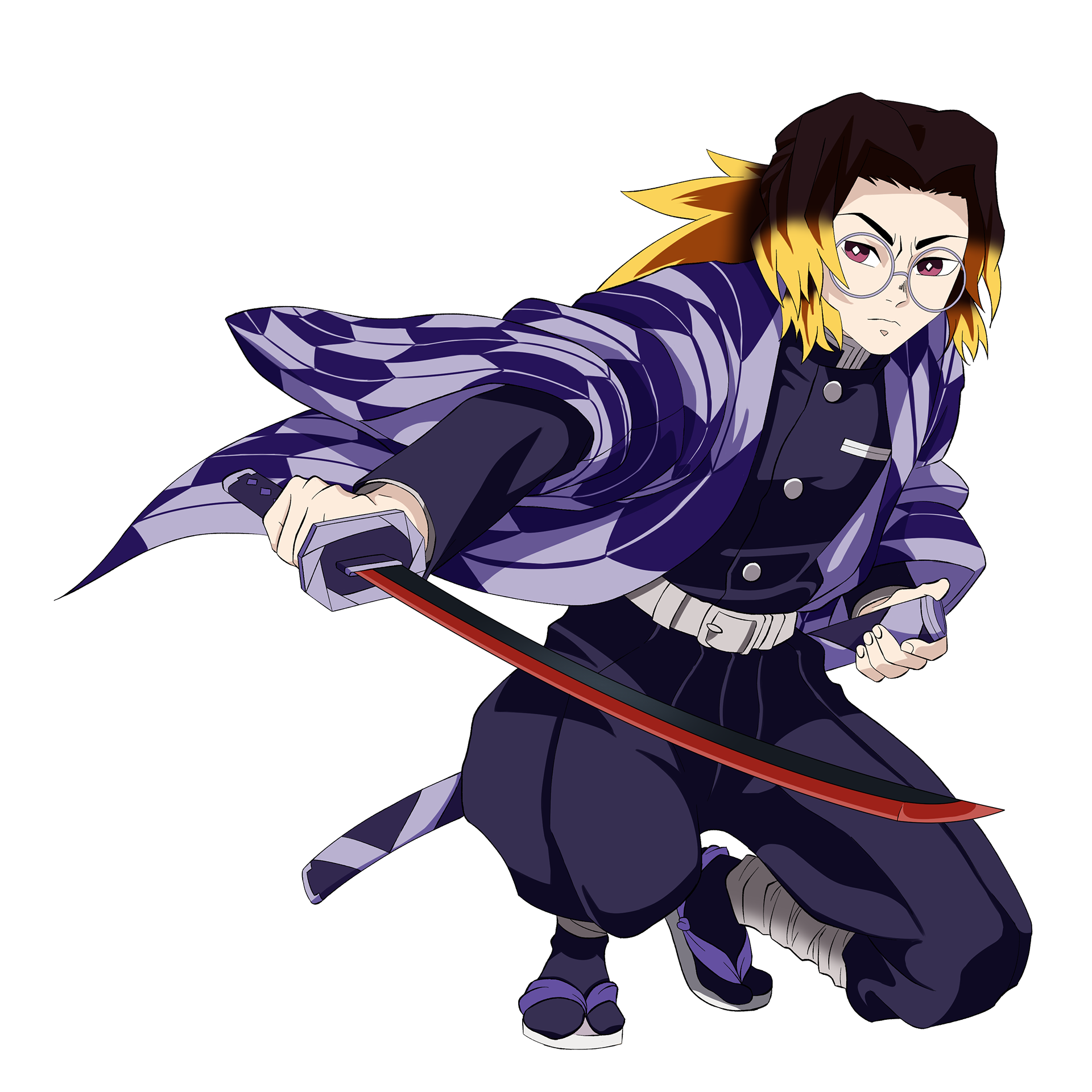
This next one was by far the hardest one to do. Demon Slayer has a very unique, very aesthetically pleasing style, but it also has the most time consuming shading I've done, even for a cell-shaded look. I was able to tell fairly quickly that the hair at least was shaded with a multiply layer, but while the previous two styles had characters with similar hair to myself, this one did not. In the end, I ended up merging two of the hairstyles I liked the most together, and while the previous styles let me simply color pick from characters, I had to make this one on my own.
After I dealt with the hair, I had to deal with the haori, the jacket every slayer wears and is unique to. For this, I looked up Japanese patterns and meanings, finding the yabane pattern to be my personal favorite. It was traditionally worn by archers back in the day, and since the show was set in the early 1920's, I thought it might be fun to be the one archer in the slayers' ranks, as I have real-world experience with the sport. I might not be a main character, but I definitely look like I'm supposed to be there.
Archery isn't terribly useful in this line of work, but it's a good distraction, at least.
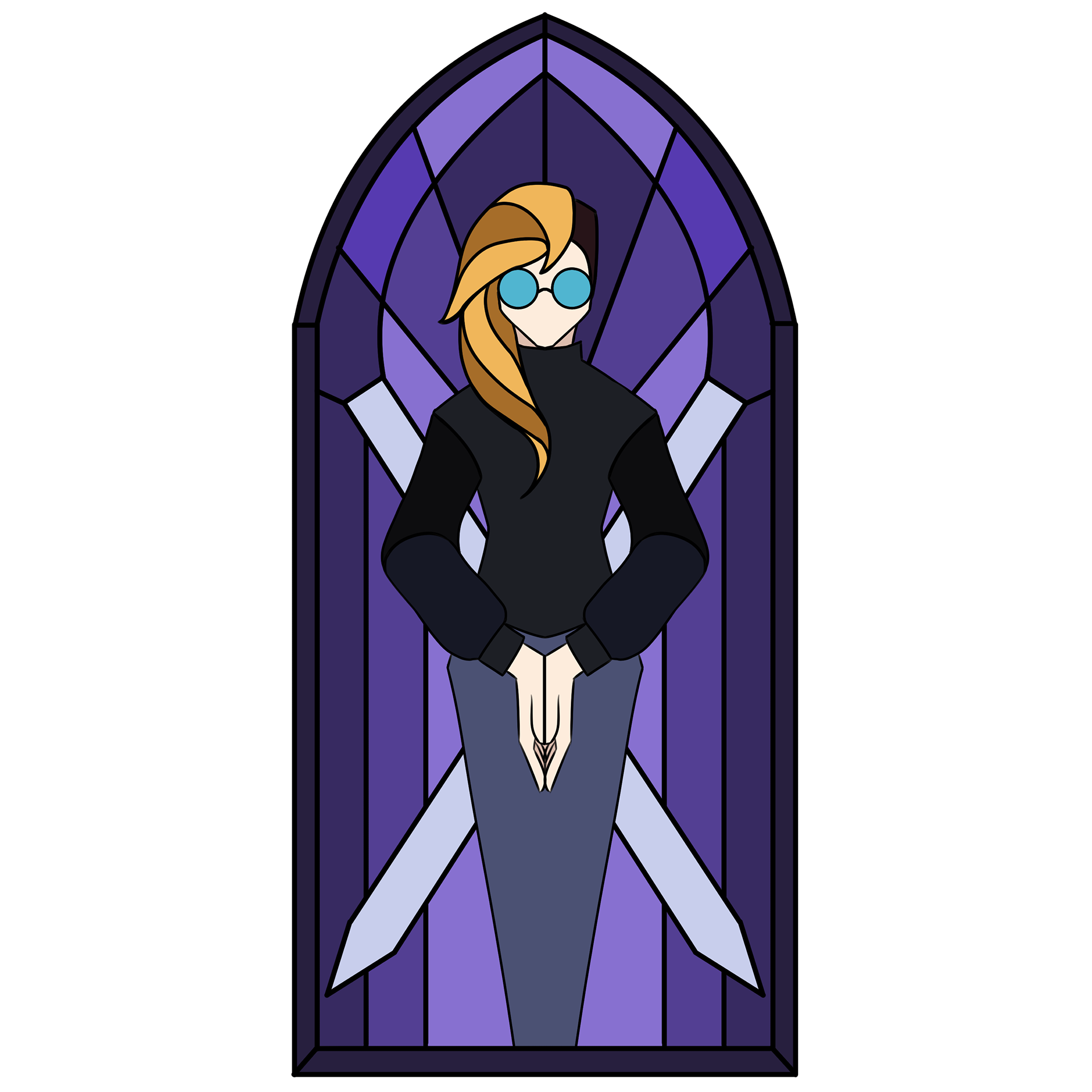
Finally, we have the easiest style: stained glass. I say easiest because if you know how stained glass is put together, it's not hard to mimic. My main inspiration for this one was those windows normally seen in a church, but I wanted to keep mine simpler. I'm not trying to be a messenger for a higher power, just a simple designer with a simple window.
Since I had total creative freedom with this piece, (more or less), I decided to wear my favorite sweater and let my hair down for once, giving the illusion of shading with the darker colors in between each segment. For the background, I kept to three shades of the same indigo purple, and made sure that my preferred method of design was present behind me in the form of two crossed pencils or styluses.
I would love to see this made into an actual glass piece.
