The Horsemen, But Musical
Challenge:
Create a series of album covers for a fictional band
War was my test sketch, mostly because I'd never drawn a horse skull before.
The research for this project was a rabbit hole and a half. The Four Horsemen of the Apocalypse are infamous, but everyone has a different story, so finding which Horsemen to use was an unexpected challenge, as the only two consistent riders were War and Death. I eventually settled on the four I had known first: War, Death, Famine, and Pestilence. I was going to make them into character portraits, but I couldn't make it work, as they just didn't feel like characters to me, so I changed gears and started sketching skulls. The more I sketched, the more I realized they would look great if I made them horse skulls instead of human, so I started looking up references.
Now, I had never drawn an animal skull before, much less a horse skull, and finding the right angle I wanted was a borderline nightmare, because every reference I found was at just the wrong tilt. I eventually found what I wanted on Pinterest, but after I sketched War, that reference vanished and I couldn't find it again.
War, the Red Horseman
With this series, I wanted it to be monochromatic, with the color specific to the Horseman's canon steed, or at least as close as I could get to it. Famine being the Black Horseman, I had to change the color a bit so it wasn't just a black blob. I also wanted the background to be simple, while still showcasing what each Horseman was about without words, some being much easier than others.
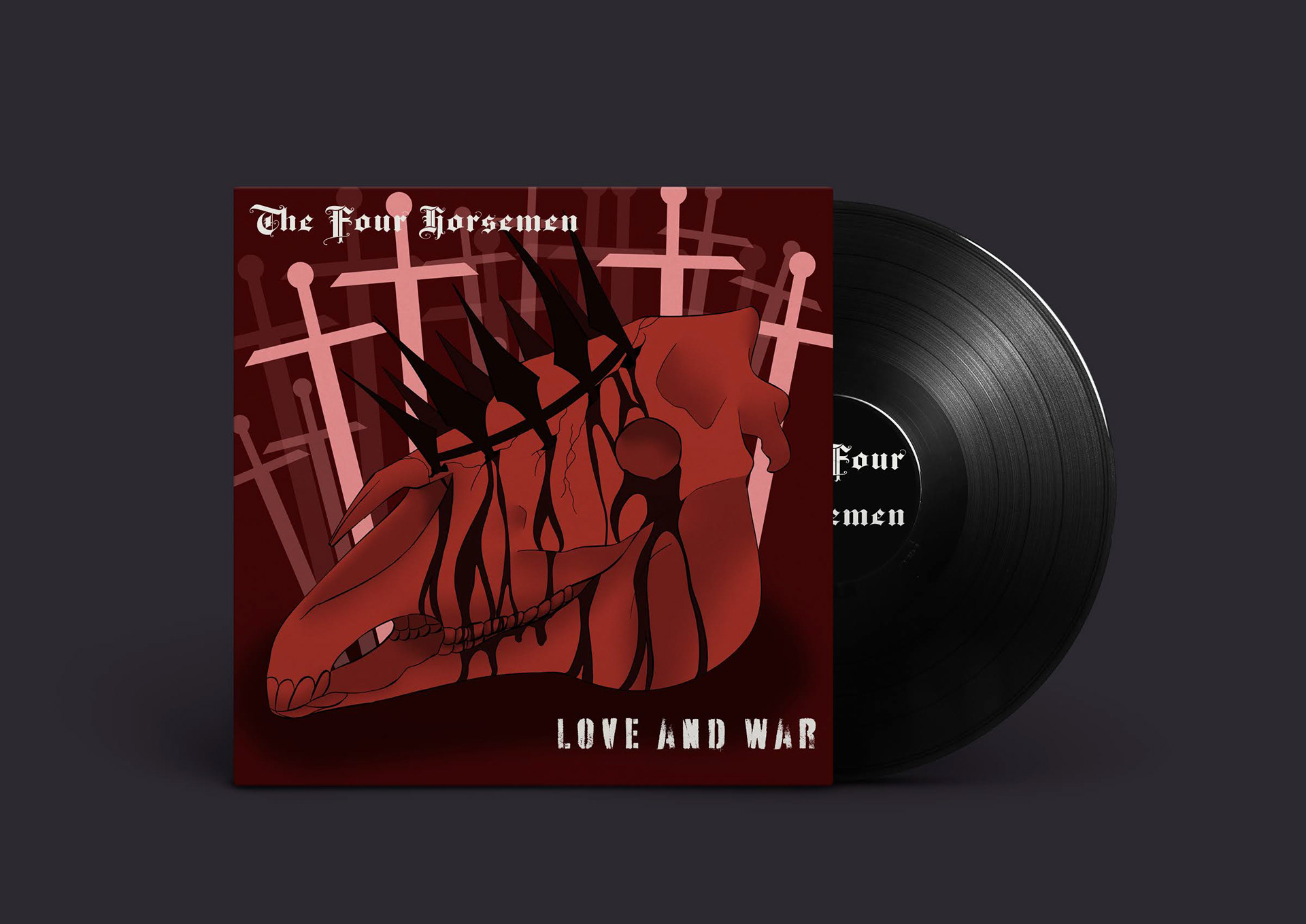
Starting with War, I digitized my sketch and made a base skull layer so I didn't have to constantly redraw the horse, before moving on to the details specific to the Horseman himself. I gave him a spiked iron crown that jammed into the bone of the skull, and had some fun adding drips of something (you can decide what) all over. Once that was done, I overlayed it all with a deep red, and started working on the background. I made a series of swords that had been jammed into the ground behind the skull, and adjusted the opacity of each layer so that they faded more towards the back, a theme that follows the entire series.
Famine, the Black Horseman
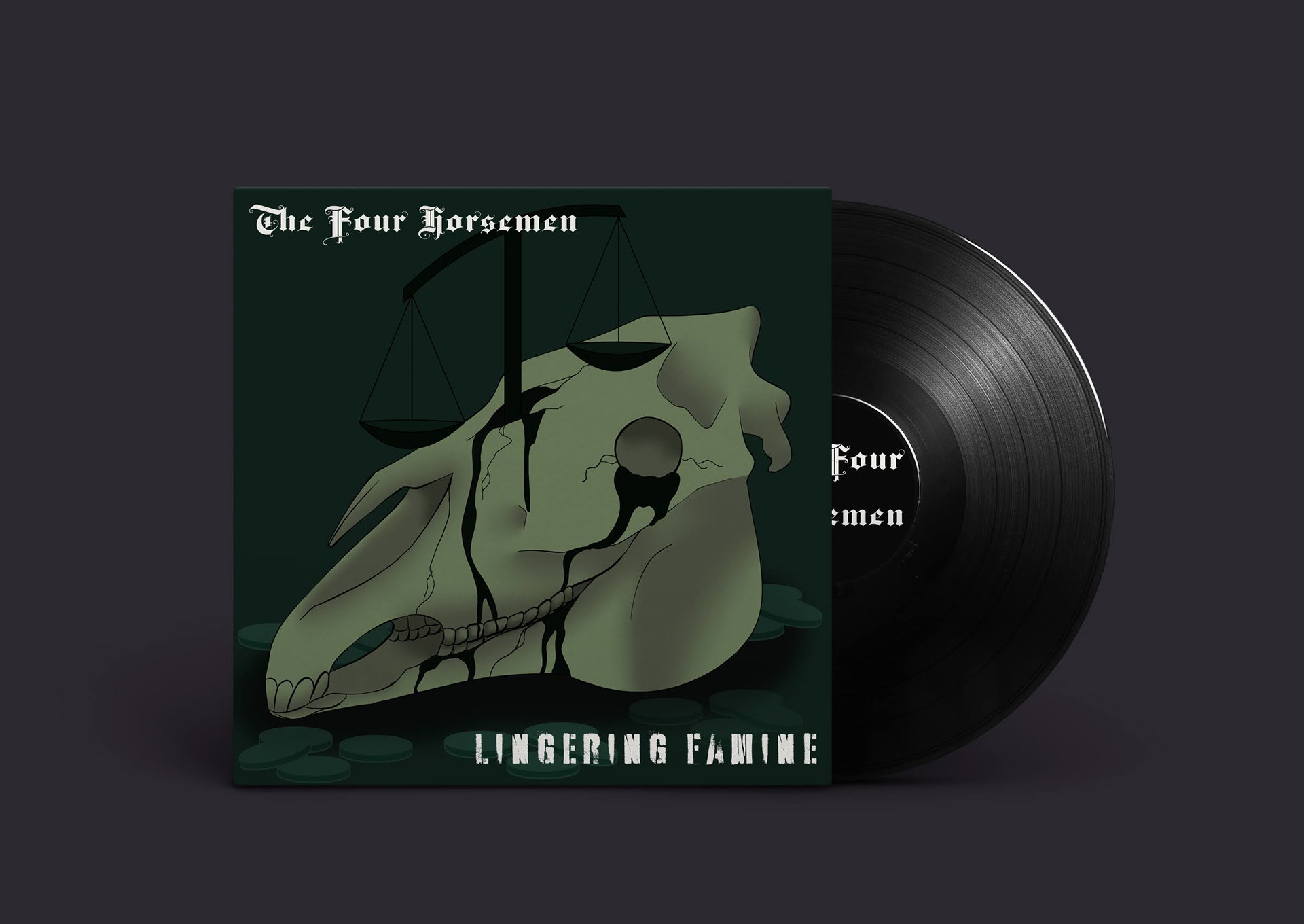
Next up, I started working on Famine. He's typically depicted with scales in his hands, heavily leaning one direction instead of perfectly balanced, as all things should be. Leaning into the scale motif, I designed the scales to be tipping to one side while breaking through the top of the skull, more mystery liquid dripping down from the opening. After that, I overlayed it all with a teal color.
When it came to the background, the typical thought brought to mind by the word famine is the lack of food, but the more I thought about how the Horseman was depicted, the more I realized he's less about how much food there is, and more about how few people have the ability to buy it, hence the imbalanced scales. Keeping with that theme, I chose to scatter coins around the base of the skull, fading them out and giving them an almost ghostly look, like they weren't really there.
Pestilence, the Pale Horseman
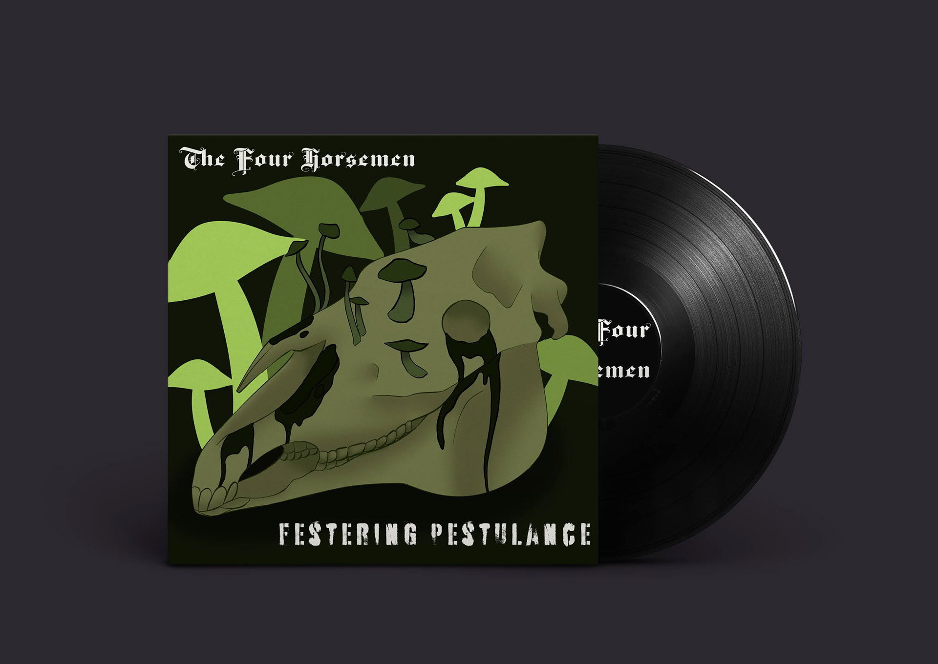
Pestilence was the third Horseman, and probably the one I had the most fun with. Instead of breaking open the skull like I did with the others, I chose to keep it intact, and had mushrooms and mold growing from it. These things are decomposers, and often make people sick when left unchecked, so they were perfect for the horseman of extreme illness. I overlayed everything with a yellow-green, and made the mushrooms in the back a more neon version of the same color, giving it a radioactive appearance, yet another dangerous thing that can make people sick.
Death, the White Horseman
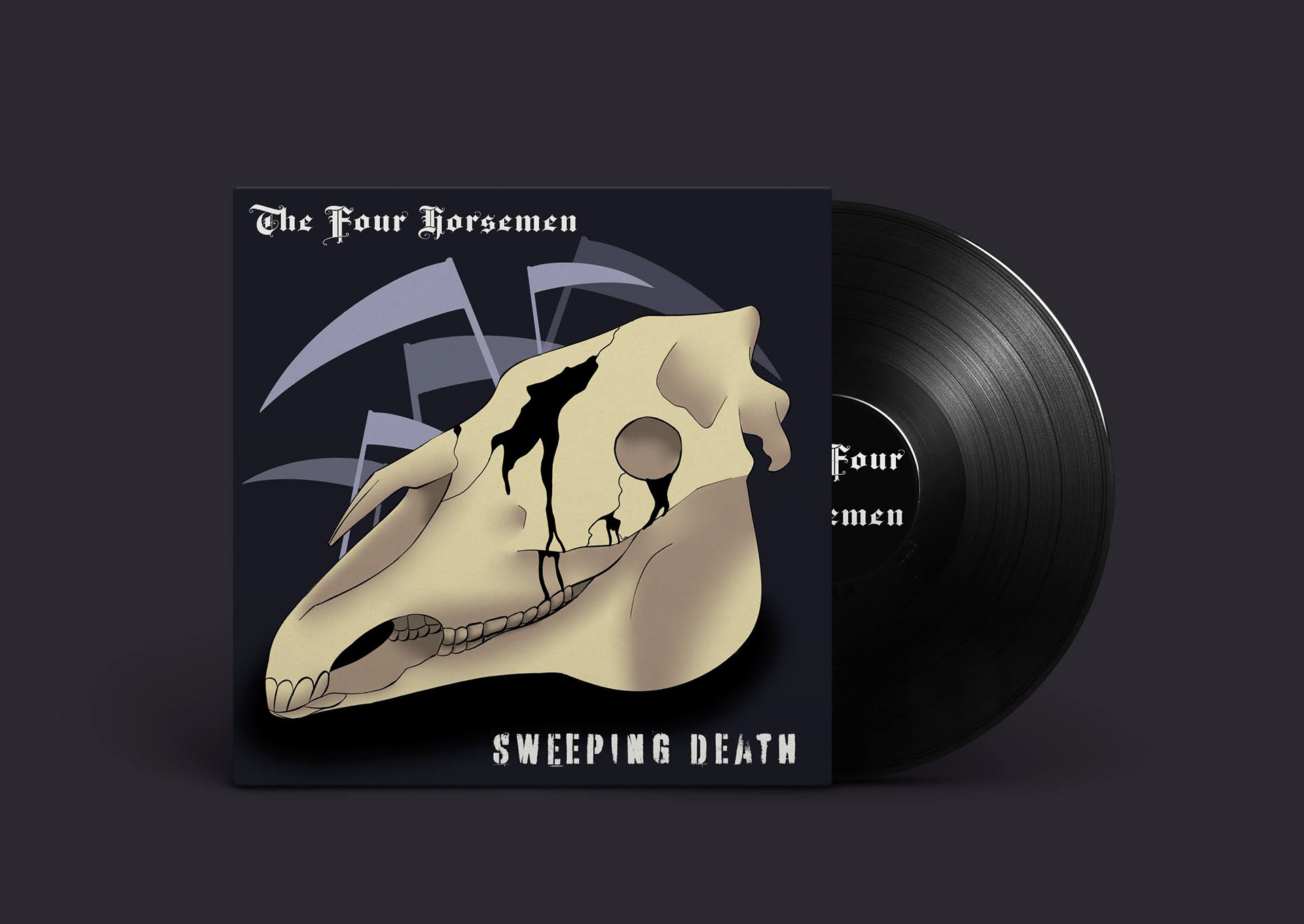
The final Horseman is Death, who is both the simplest and somehow the most complicated. I didn't go into this one with a plan, unlike the others, because it's kind of hard to make the horse version of the Grim Reaper without a hood, and I didn't want to cover up the skull, so I gave him some cavernous gaps and cracks before moving on. Being the White Horseman, he didn't get a colored overlay, but I made his background a dark blue, keeping his iconic scythe in a pale color to make it stand out.
Once he was finished, I brought them all into Adobe Photoshop to mock them up as album covers using a mockup from freepik.com. I decided the name of the band was The Four Horsemen, which I selected a blackletter font for, and the titles of each album was the name of the Horseman, the font being a distressed stencil.


