The Traveler's Best Friend
Challenge:
Create postcards for fictional locations using only Adobe Illustrator
For some, the idea was easy. For Bag End, it was not.
This was a self-imposed challenge, as I tend to use Clip Studio paint for my illustrations, (as I'm sure you've noticed. Unless this is the first project you're visiting, in which case hello :) ). Once again showing off my high level in nerd, I chose my favorite fictional locations: Bag End from Lord of the Rings, Vulcan from Star Trek, the Valley of Wind from Studio Ghibli's Nausicaä of the Valley of the Wind, and the sky village of Zephrah from the Dungeons and Dragons group Critical Role. I was going to make a postcard for Knowhere from Marvel's Guardians of the Galaxy, but I wanted to challenge myself and not have a humanoid for once.
I started with Zephrah, the sky village from Critical Role, because I knew I was going to have a hard time with the large tree that took up the center of the village. I started by bringing my sketch into Adobe Illustrator and outlining each part in black using the pen tool. Once I started to add the colors, I rearranged the layers so the mountains were behind the tree and not above, and began the long process of making each component a clipping mask.
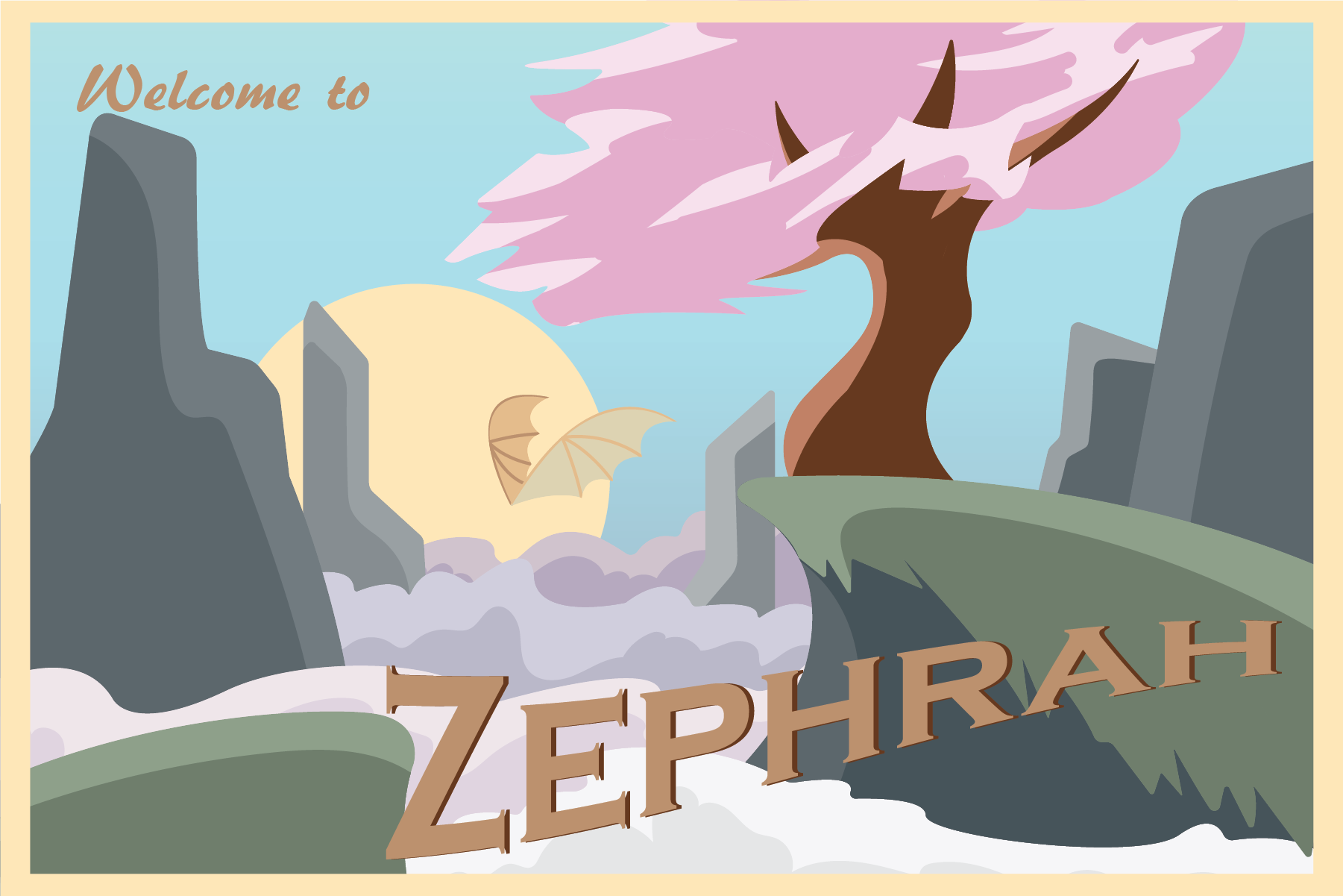
Zephrah, home to the druidic Air Ashari.
With the clipping masks in place, I was able to add the stylized shading with ease, using the pen tool for the mountains and the brush tool for the clouds for more control. To shade the pink of the tree, I used the brush tool the most, and fought with it for a while before landing on something I liked, giving it a directional light source with the sun in a natural way that made it still seem like there were layers of leaves and petals. I kept the colors light and leaning towards a more pastel color palette, as Zephrah is canonically a very bright place in the mountains of Exandria.
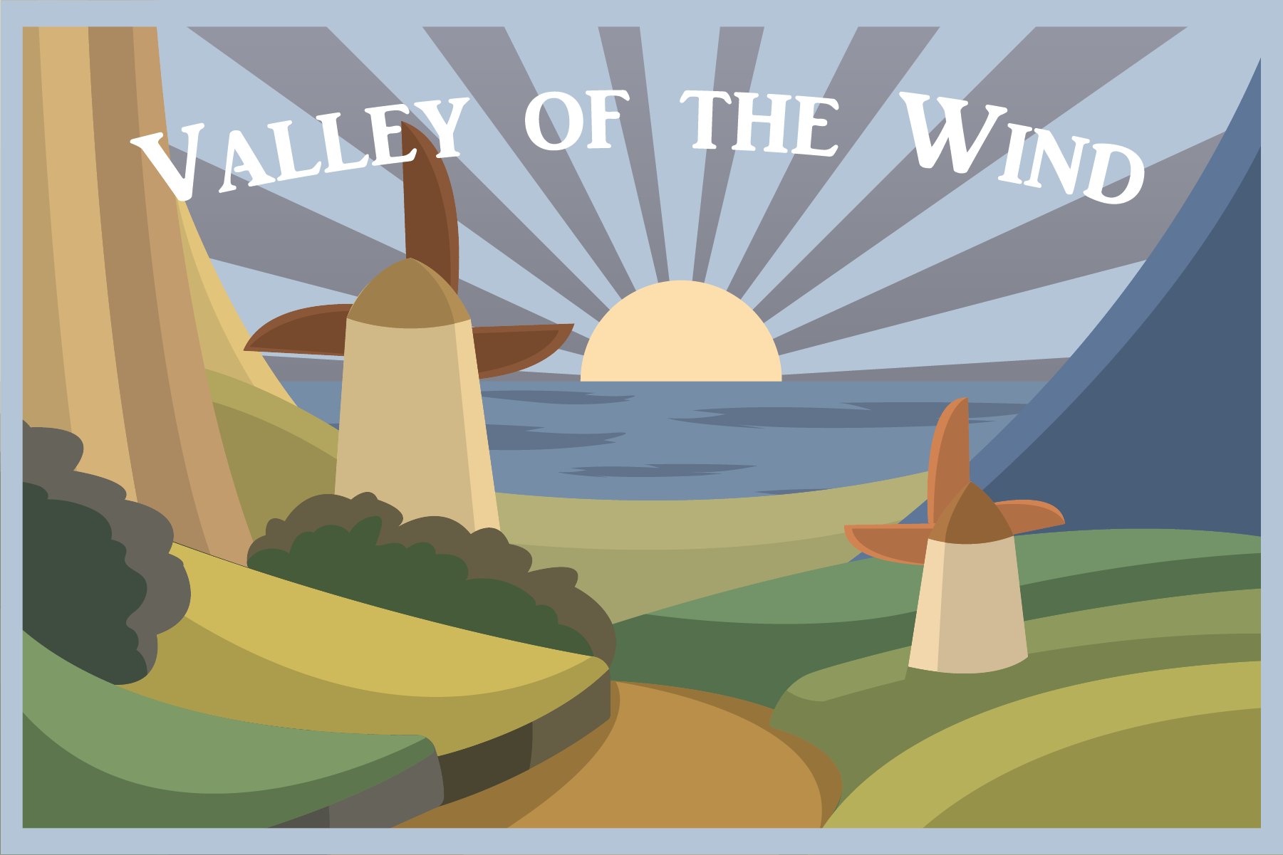
Moving on to one of my favorite movies, I started working on the postcard from the idyllic Valley of the Wind, a small kingdom filled with windmills and farmland. I sketched my layout based off a screenshot from the 1984 film itself, one of the opening shots that showed the entire valley, then brought it into Illustrator like I had with Zephrah.

The Valley of the Wind, one of the few places left that isn't infected by a dangerous spore.
The biggest challenge I had with this card was the water of the ocean, as it's surprisingly difficult to make water. I was going to leave it flat, but it didn't feel finished, and kind of blended into the background with the sun rays, so it needed something to bring it forward again. For the sun's rays, I took inspiration from the old Japanese flag used in World War II, as I thought it was fitting for the Japanese film and overall message of the movie.
With the Valley completed, I moved on to the hardest card of the series: Bag End. This one really gave me a run for my money, because it was a lot of foliage, and it's a very iconic location, so I wanted to do it justice. I used a picture from the real-life place in New Zealand as my reference, and color-picked directly from it, making the colors as accurate as I could.
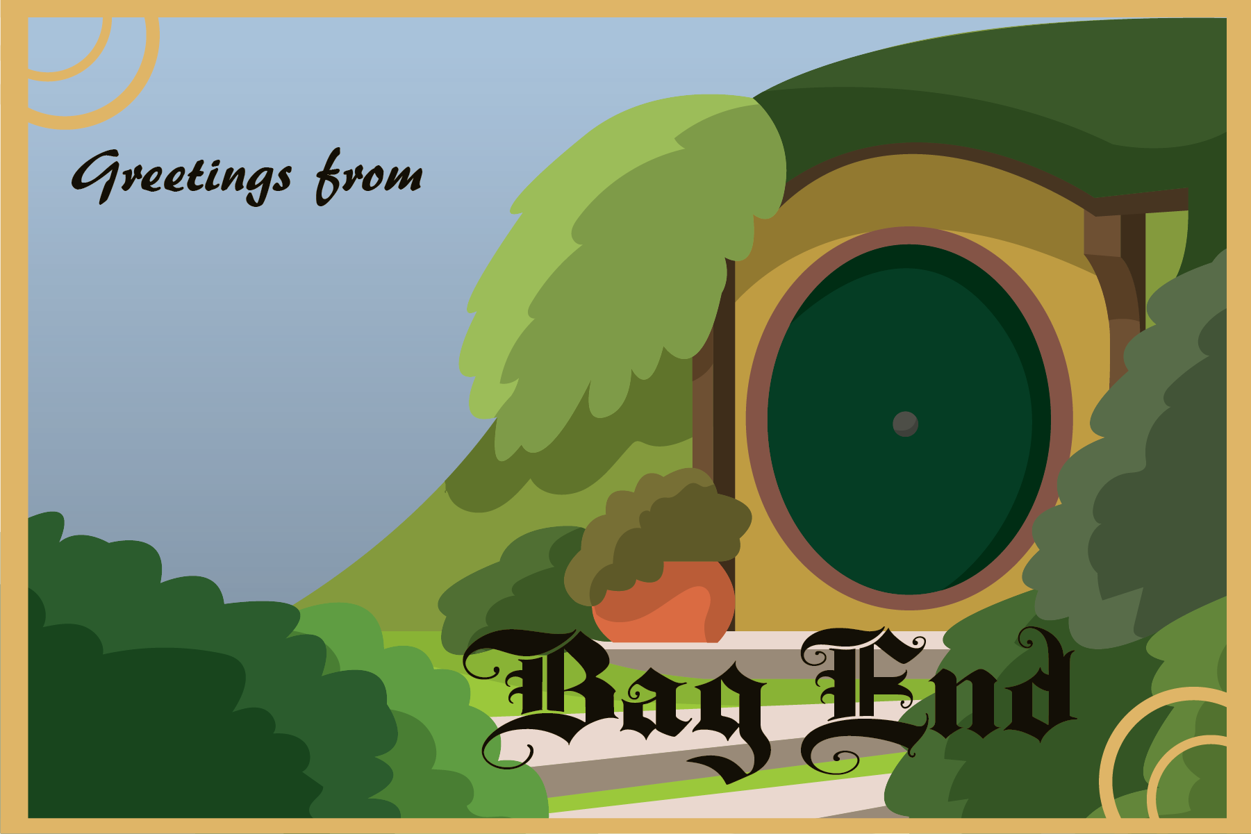
Bag End, home to Bilbo and Frodo Baggins. Technically a real place in New Zealand.
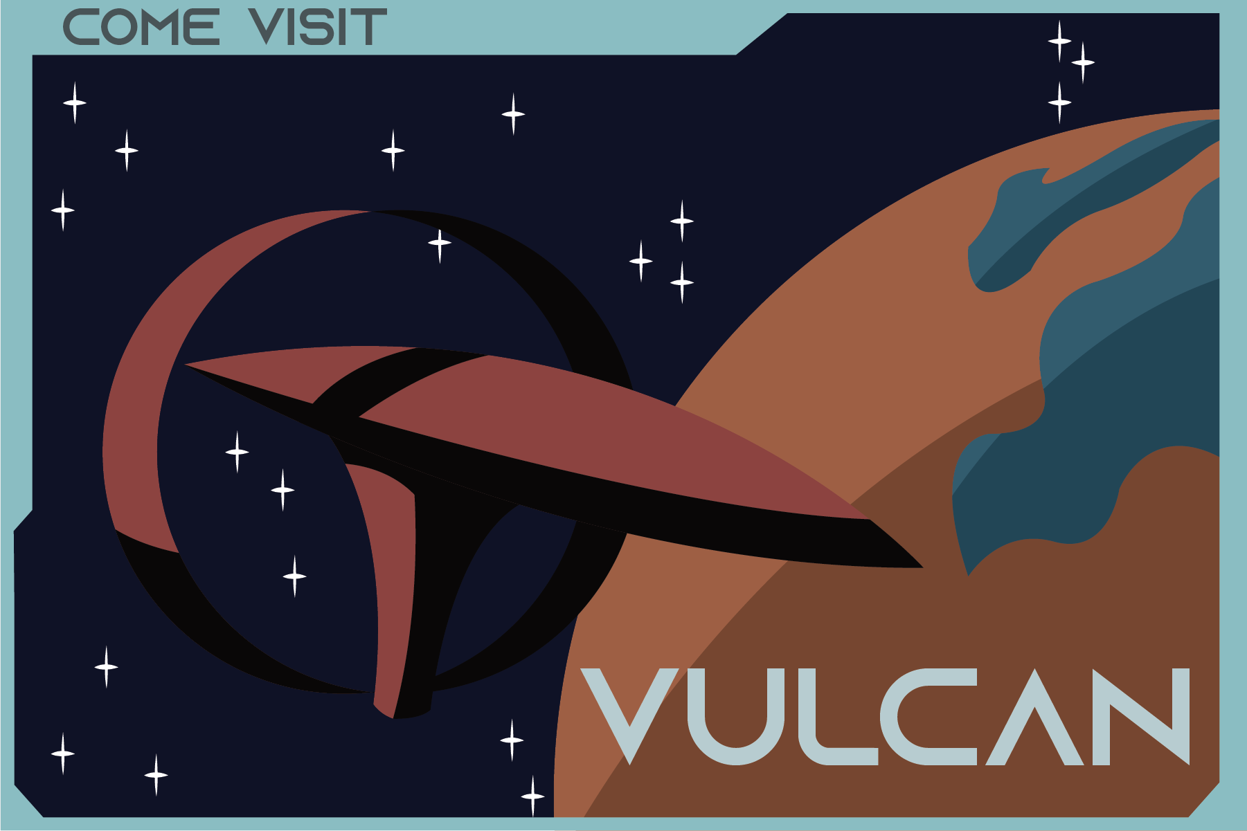
Last but not least, I made a postcard for the planet Vulcan. Technically, I don't think they would have anything like this, as the Vulcans are very logical and would probably find a way to explain why they don't need this, but they can't stop me from making them one anyway. I found as many references of the planet as I could find, (both from the surface and up in orbit), then had to decide what class of starship I was going to use. I settled on their largest vessel, mostly because I liked the shape and silhouette of it the most, but it also helps guide the eye to the text and the planet itself.

Planet Vulcan, home to the highly logical Vulcans. Do you think Spock would approve?
Moving onto the text, I wanted the font choices to reflect each location. For Zephrah, this meant a serif font that had a bit of play to it, since the leader of the village there is a bit of a nervous wreck sometimes. Valley of the Wind also got a serif font, but I chose a slightly more formal font to differentiate it from the fantastical druidic village, and to show the slightly more serious feel of the place. Bag End of course got an old English blackletter font, and Vulcan received a san-serif, sci-fi font that you might expect to see if you were looking at a screen in that universe.
With the text added, all I had to do was add a frame that matched each postcard location, and the series was finished.