Coming Soon, To Theaters
Challenge:
Create an event poster for a fictional event
Of course the one I liked the most had the highest number of characters.
When my class was told that we would be making event posters as our first project in Editorial, I knew I wanted to do something that no one else was doing. I’d seen movie premier posters everywhere as a kid growing up in Los Angeles, California, and the closer to Hollywood you got, the more you saw, so I decided I wanted to try my hand at the movie business myself. I already had some personal comic ideas, so adapting them into a big-screen event wasn’t too hard for me.
My biggest inspirations for these posters was the illustrator ABD Illustrates on YouTube for his layout and compositions, and the Terminator Salvation premier poster from 2009. I wanted the movement that ABD incorporated into his layouts, but the intensity of the Terminator imagery, and it took some work for me to get something I liked.
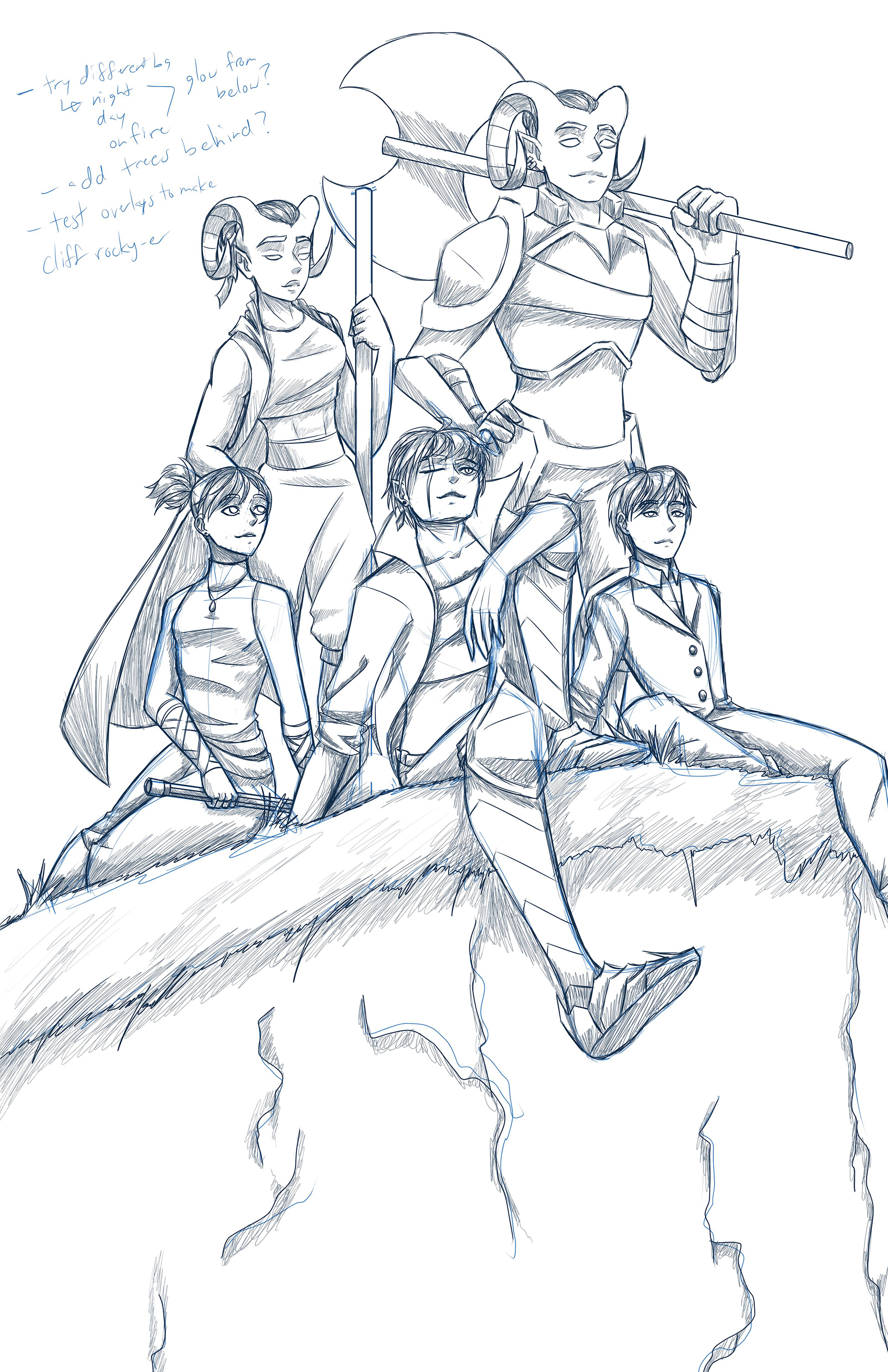
Having a refined sketch be digital makes it much easier to fix glaring issues.
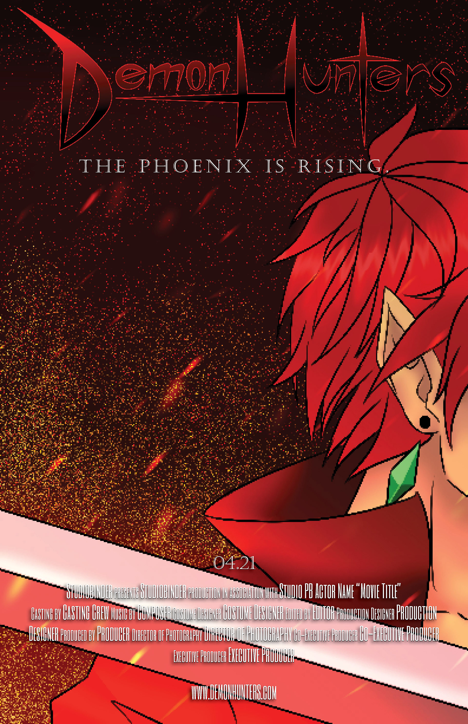
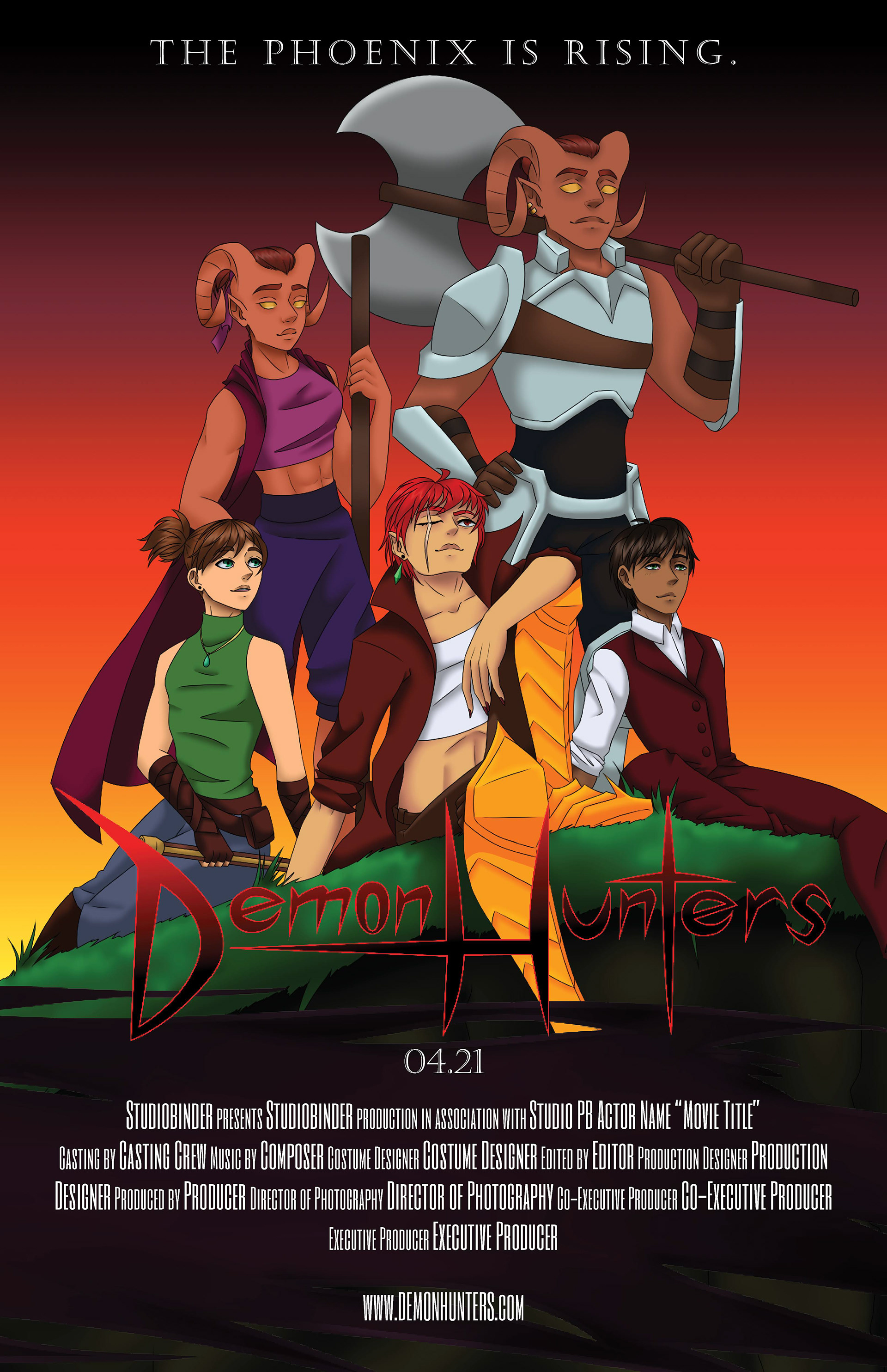
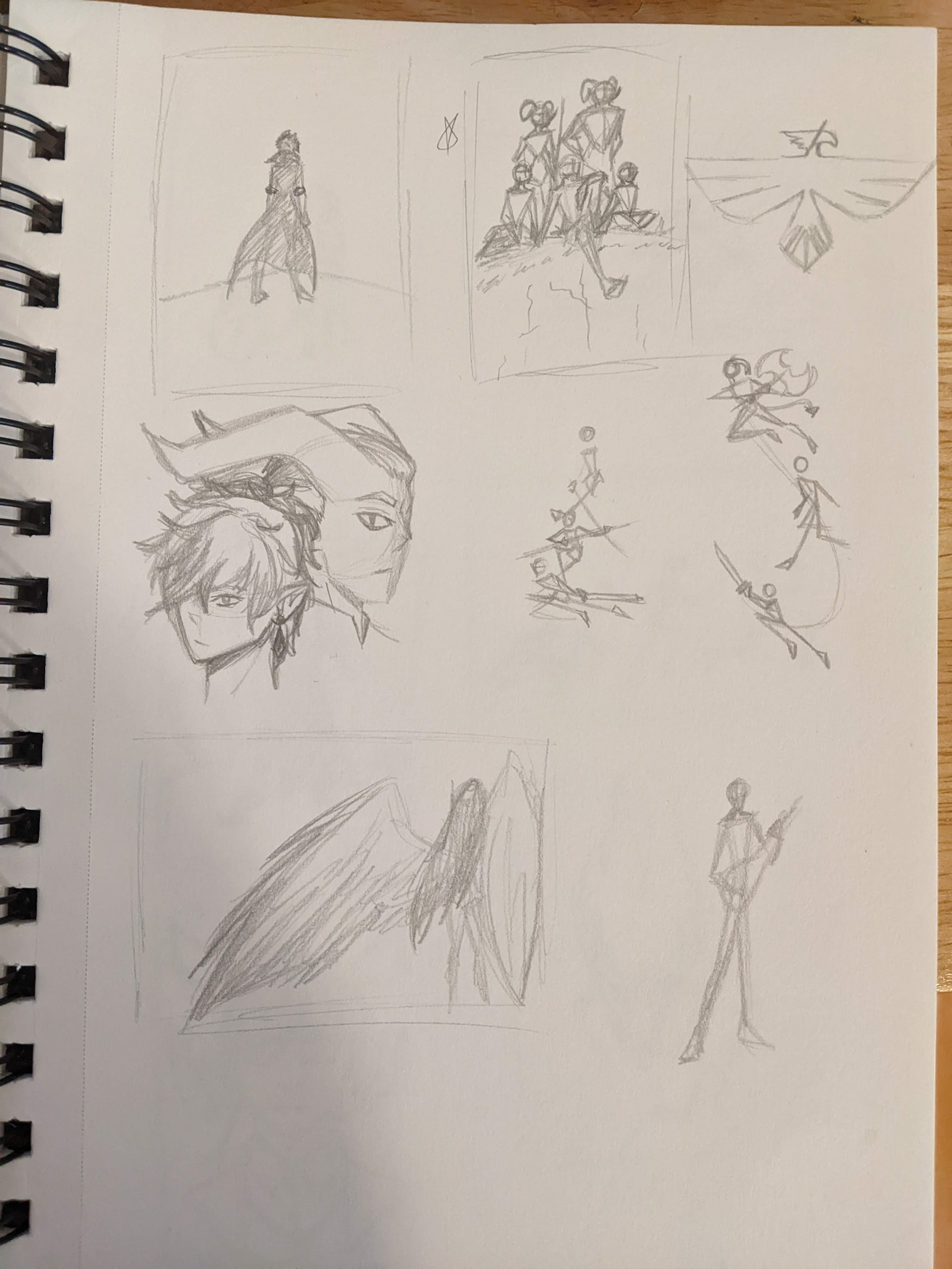
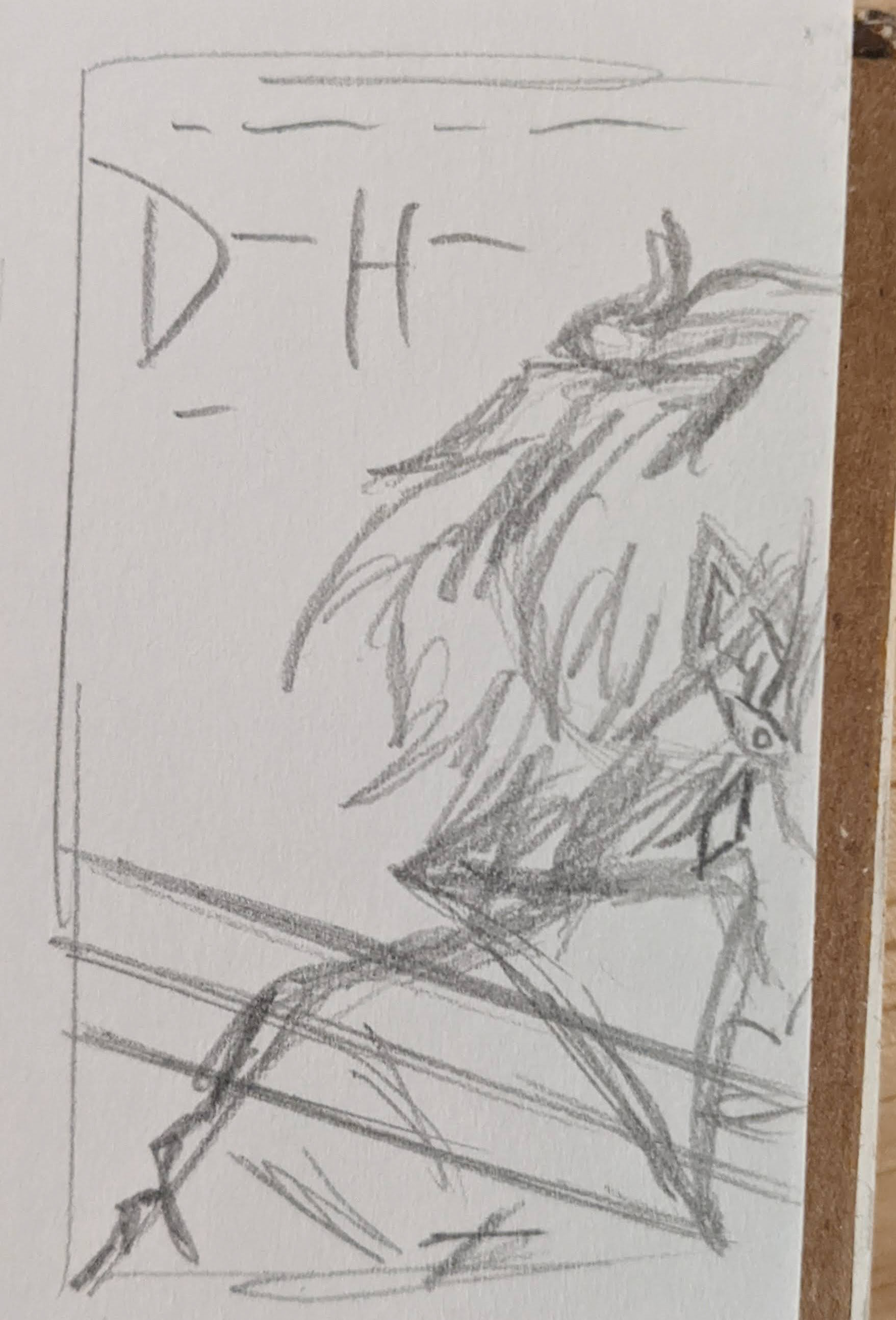
When the project was introduced, I started with thumbnail sketching of various ideas I had, originally going for a Western movie idea before switching to an urban fantasy instead, as I liked those idea more. The drawback was that the fantasy idea had more characters to draw and lay out, so I compromised and made the characters the main focus by keeping the background simple. It still took upwards of 15 hours to complete, but it was worth it.
Once I was happy with the layout of the characters and all of the proportions were correct, I moved into Adobe Illustrator to make the title. I was originally going to make it in InDesign with the rest of the text, but I couldn't find a font that I liked, as nothing had the right visual impact I was looking for. So I did a quick sketch of what I had in mind, then traced over it in Illustrator and made adjustments as needed to make it a legible font face.
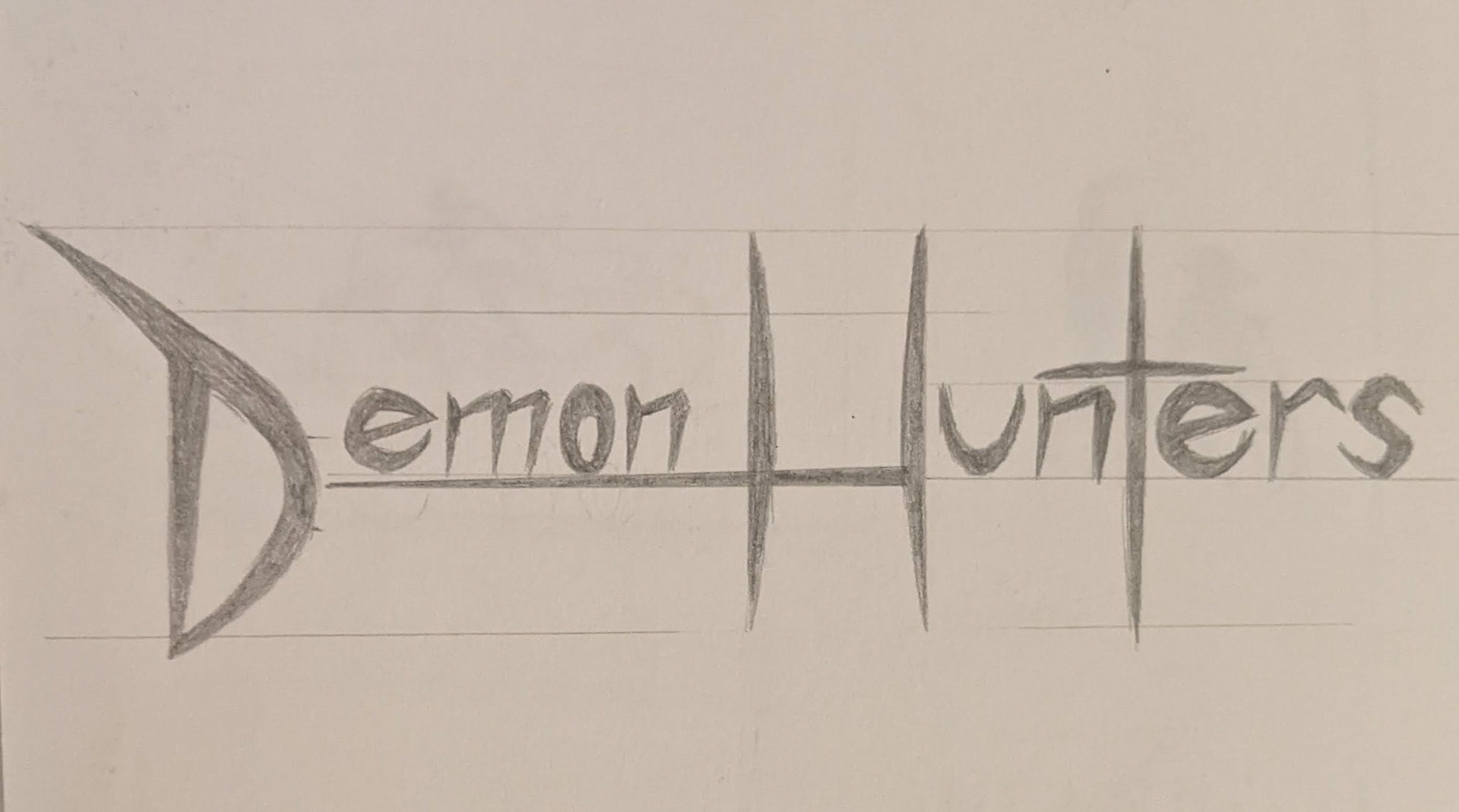
I sketched out a custom font for the title of the movie, then cleaned it up in Illustrator.
Once the title was finished, I brought everything over to Adobe InDesign and began laying out my text in a way that looked both correct for a movie poster, and visually appealing. I chose a font that best matched both the title I had custom-made, and the over-all feel of the fictional movie I was creating, landing on the serif Castellar after a few other tries that didn't quite make it.
With the text laid out and the font matched, I got to work making the next variant, having the "main" character bleed off the page, like her picture had been taken mid-swing. With it, however, came a new challenge: The credits blended into the sword so much that they became unreadable. I tried making them a darker color, but I had a similar problem with it blending into the line-art too much, so I went to my professor for some help, and he suggested a drop shadow to help them stand out from the bright background. I kicked myself for not thinking of that sooner, as the moment I added the drop shadow, you could read the credits again. It's always the simple things that get me.
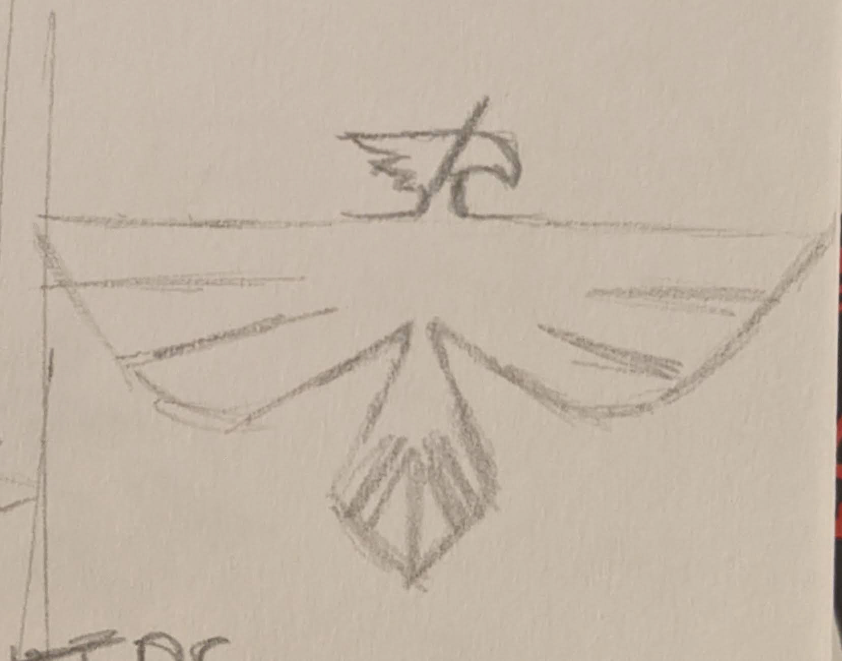
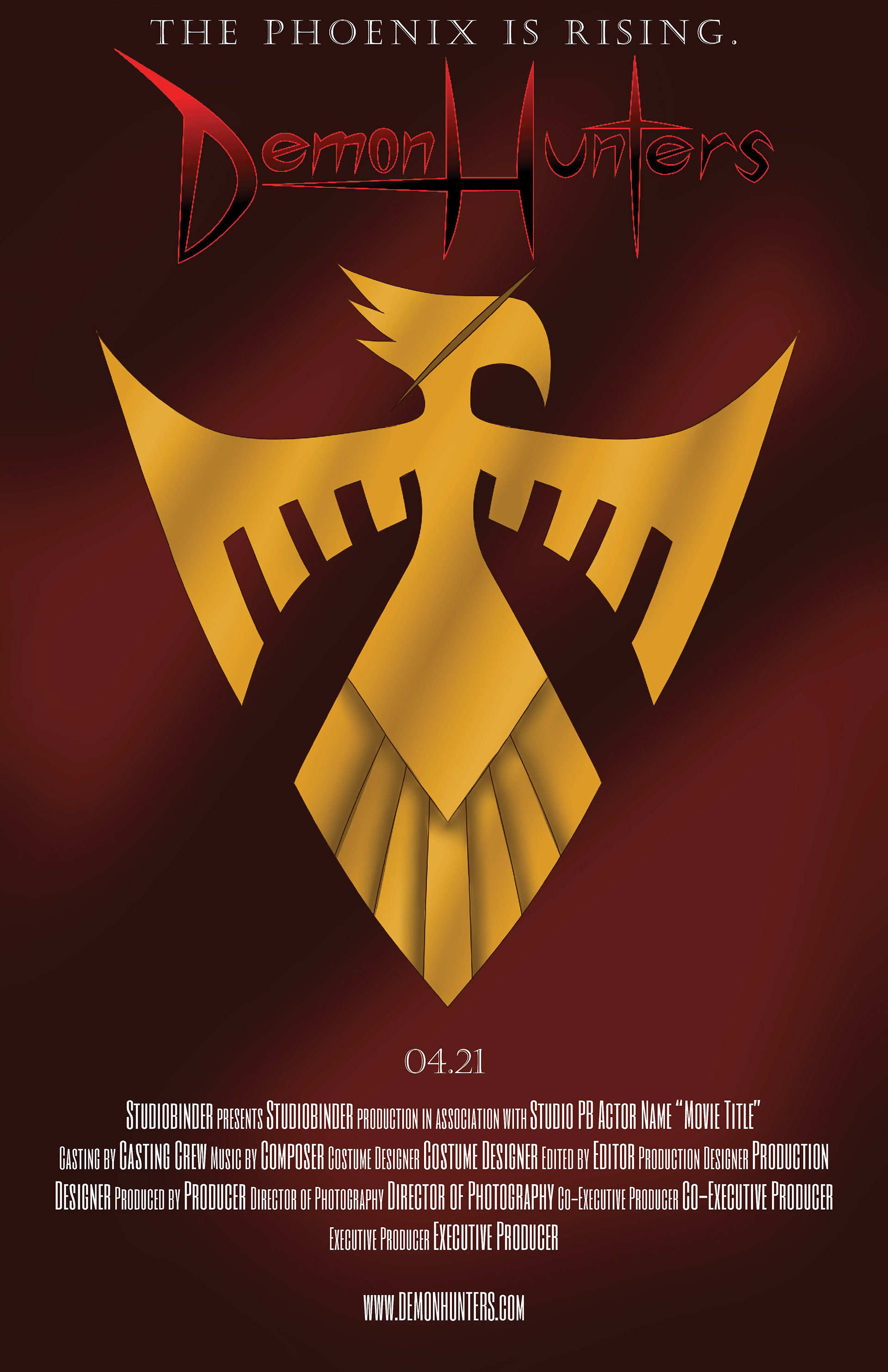
Amplifying the "phoenix" vision I had created in the previous iterations, I developed a logo for the main character.
For the final poster, I wanted to make something simple, since the other two were fairly complex in their composition and layout. Since this was a fantasy film, I figured there would be a coat of arms somewhere, be it on a shield or on a flag, so I developed a logo that would convey an actual phoenix. While sketching ideas, I starting thinking that a more shield-like shape would make for a more interesting design, making it clear that this was a protector of some kind, or belonged to a protector.
Once the logo was finished, I made the background look like the same fabric that one of the characters was wearing, like the shield was on their back or on a flag. I dropped the final design into InDesign, added the text, and made the last few adjustments to make it all fit properly before adding it to the final series and calling it not just good, but good enough.