Music Makes Movies
Challenge:
Create a movie poster based on a song title or lyric
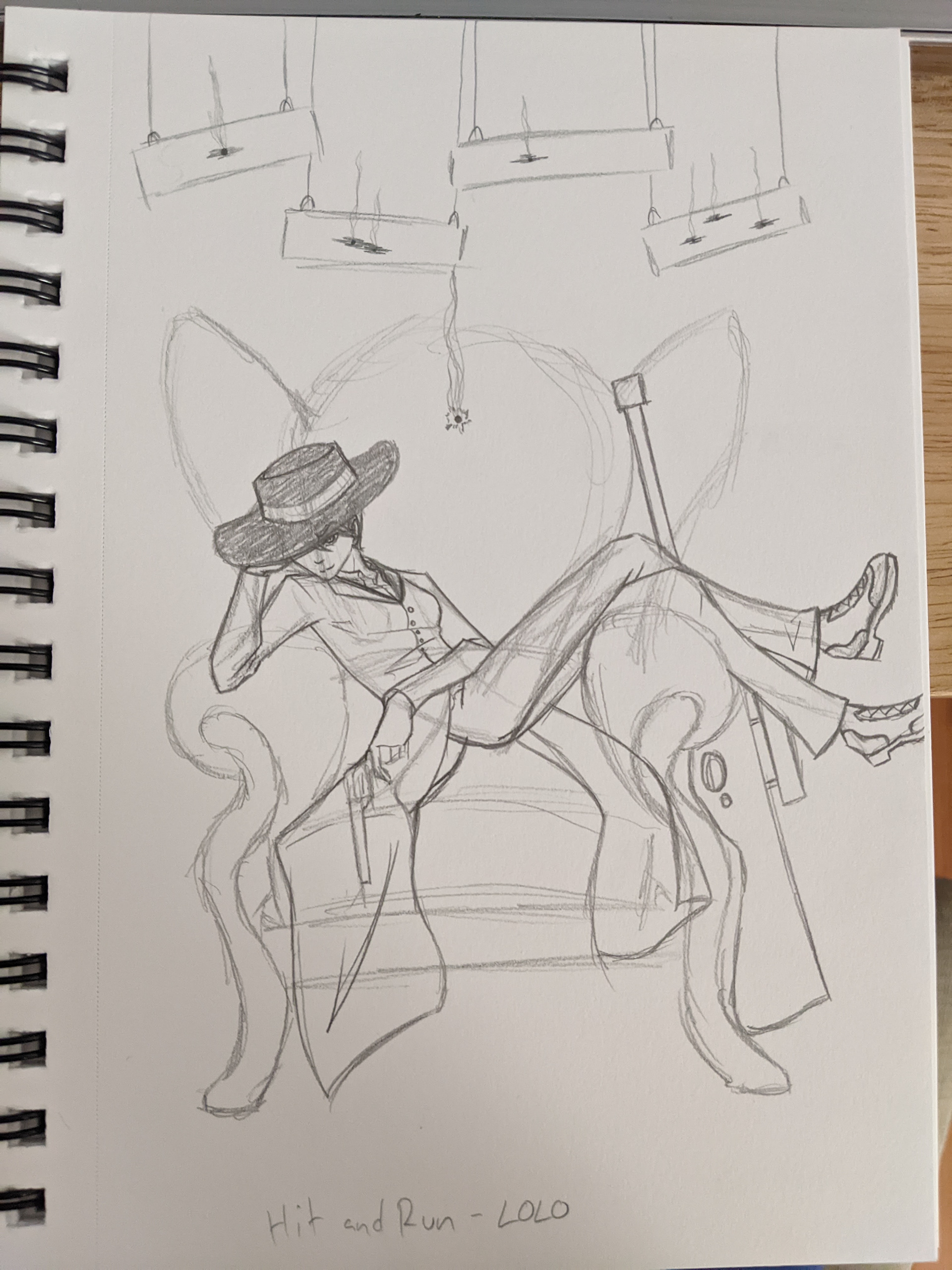
A gunslinger you probably want to avoid
I was challenged to find a song or two that I enjoyed and turn it into a movie poster using design techniques I’d learned in class. Music is a huge part of my inspiration and workflow, so of course I was excited to do this project, and of course the hardest thing to do was pick a song. Not only did I have to choose a song I enjoyed, I had to choose a song that I could turn into something that resembled a real movie poster.
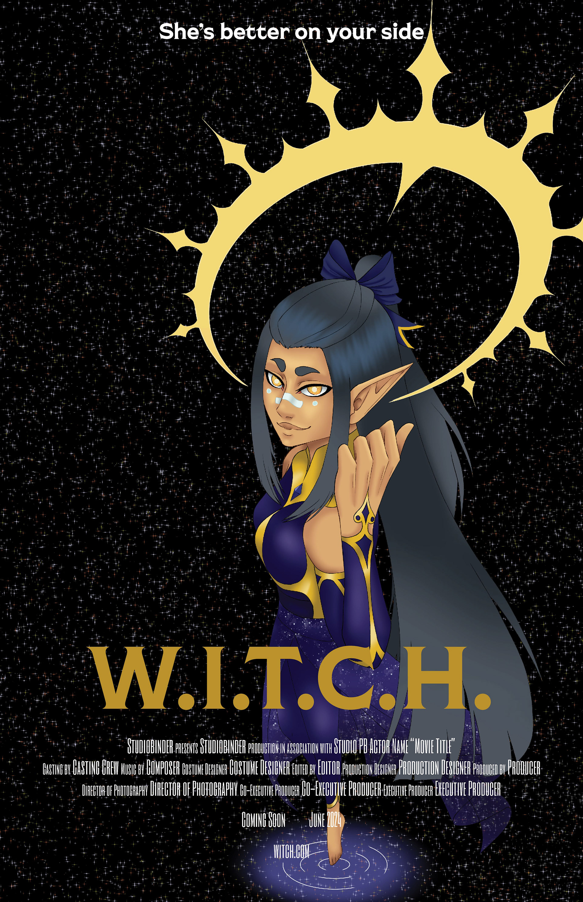
My main inspiration for this piece was an animated movie poster, where the main character (or characters) is centered on the poster and usually looking directly at the camera. I’m partial to the darker songs, though, so I decided I would make a moodier piece in a similar style, like it was meant for a more mature, adult audience instead of the usual child to young adult age range. I’m edgy, I can’t help it.
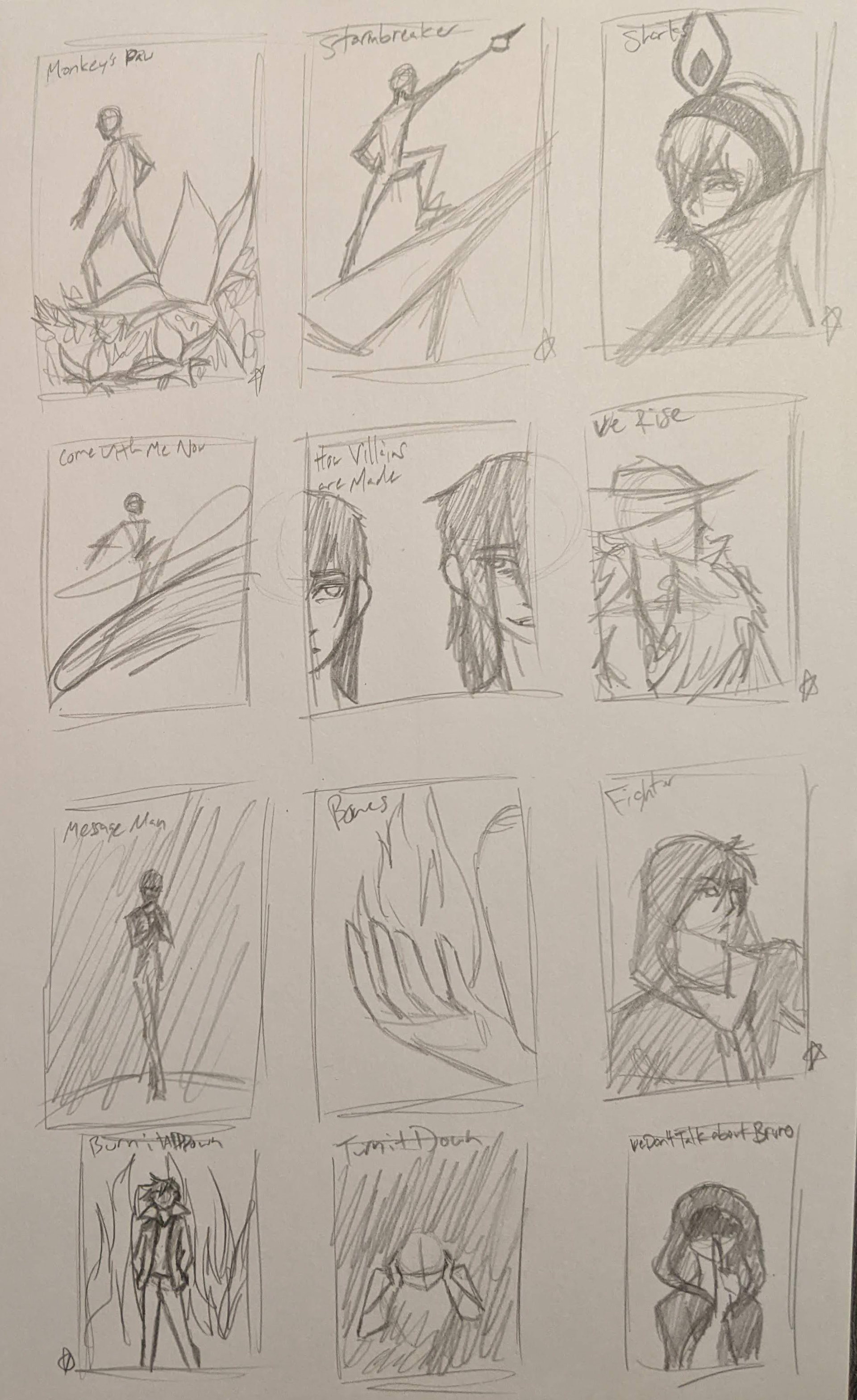
I had a lot of ideas when my professor gave us this challenge, so choosing was difficult.
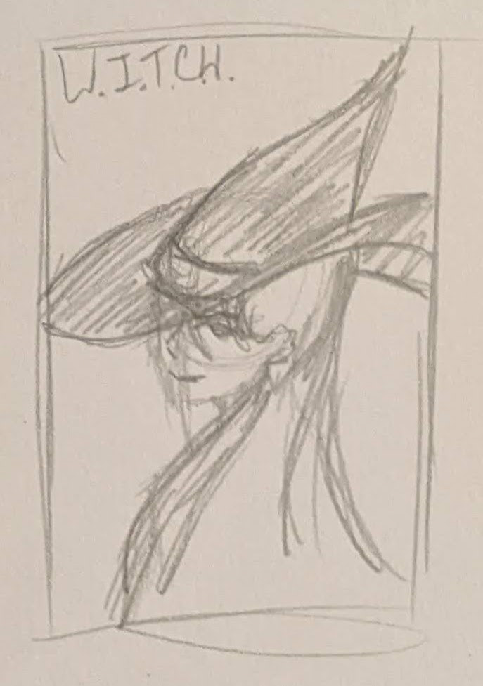
With that in mind, I started the design process with sketching thumbnails for a few songs I wanted to try my hand at, with various posing and layout possibilities scattered around as well. From that batch of nine or ten, I selected my favorites, and moved on to refined sketches of three or four, because I still couldn’t decide which songs I wanted to do, and brought those into Clip Studio Paint to make the digitized sketch. Digitizing the sketches let me adjust proportions, angles, spacing, and made drawing a chair properly possible, and once I was happy with the sketch adjustments, I began adding color.
With the illustration finished, I brought it into Adobe Illustrator to add the text, because at the time, I hadn’t learned how to use InDesign yet, and it was the next best thing. I’d settled (finally) on “Hit and Run”, by LOLO, and made it seem like a Western focused on a bounty hunter with a few tricks up her sleeve.
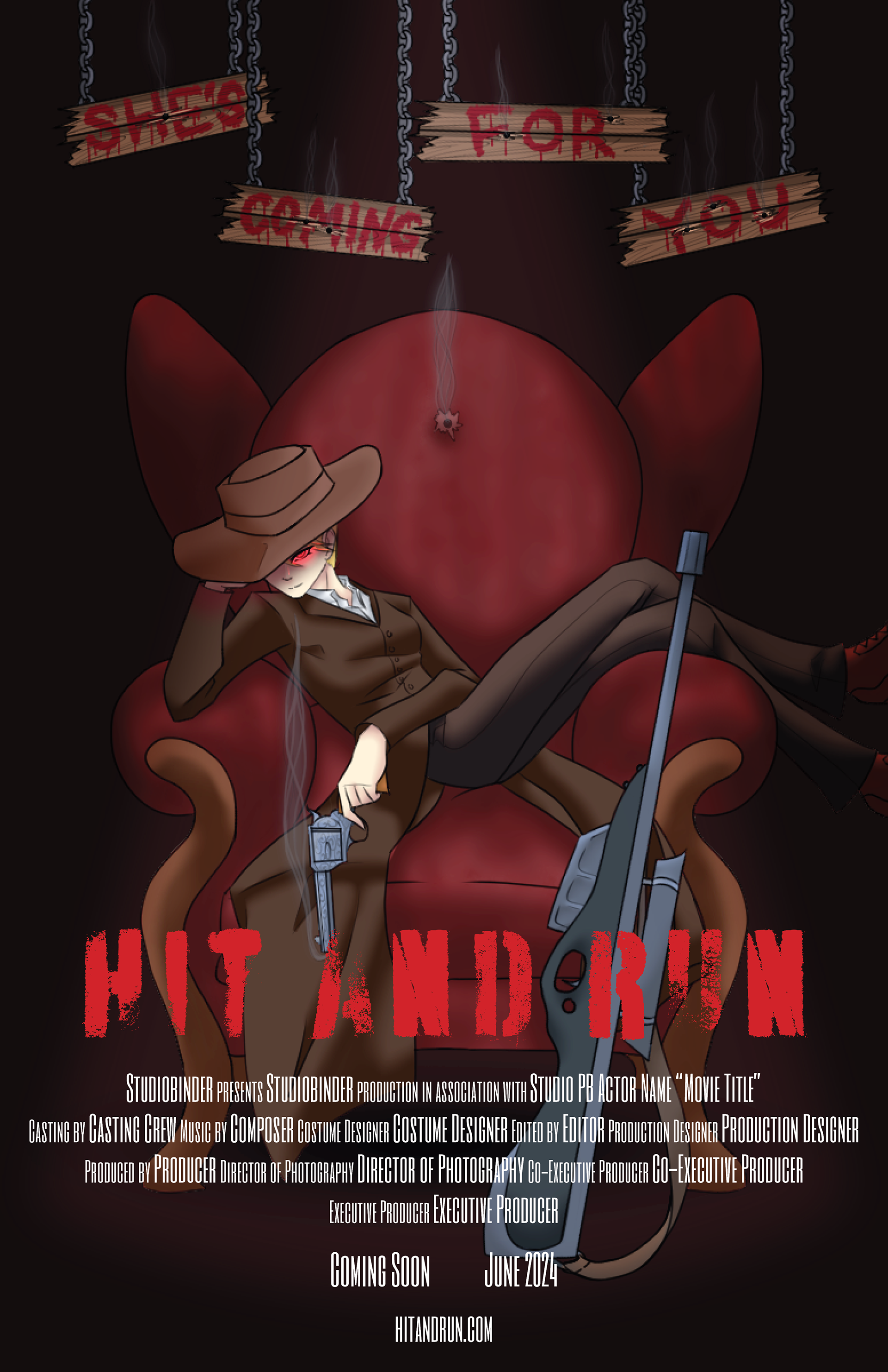
Hit and Run by LOLO as a Modern Western
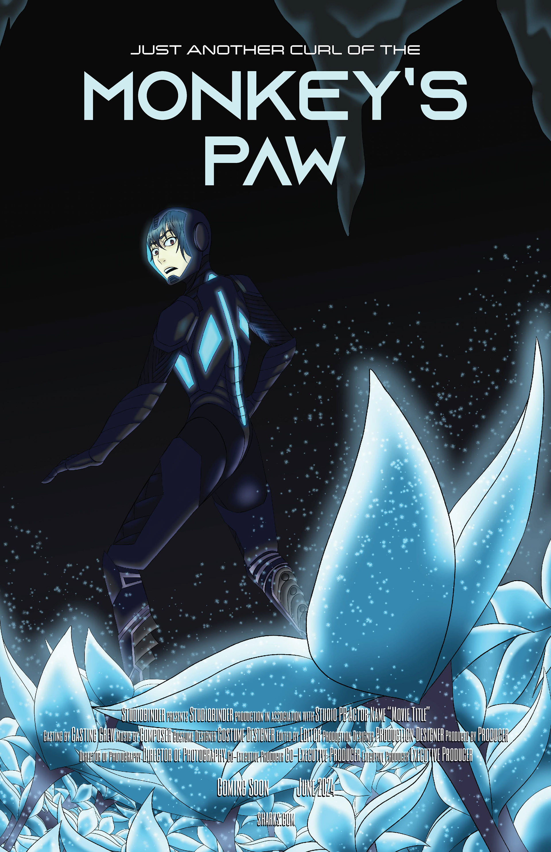
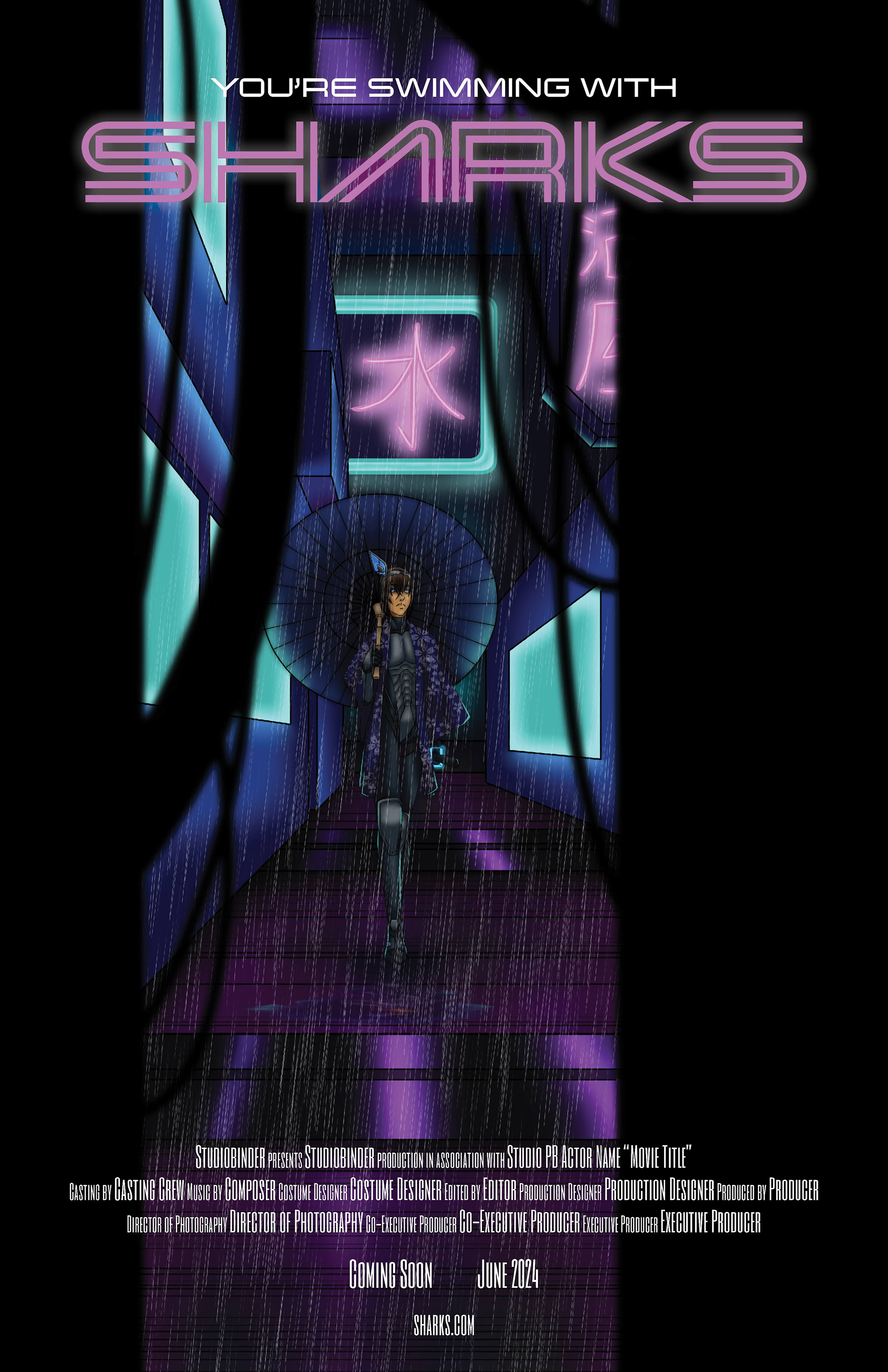
Once I did learn InDesign, I went back and cleaned up the credits along the bottom, turning it into a single text frame instead of half a dozen little ones. After that, I changed the title and catchphrase for each poster, matching the song to each font. W.I.T.C.H received a slab serif, Monkey's Paw and Sharks were given a futuristic san-serif, and Hit and Run was given a degraded stencil. Can you guess which one took me the longest?