Plane Shifting Across the Realms
Challenge:
Create a surreal world using only free images found on Unsplash.com and Adobe Photoshop
I broke the project down into numbered lists and started rolling
One of my first projects with Photoshop was the challenge of making a surreal world strictly out of images I found on Unsplash. When my class was first introduced to the project, I had so many ideas that I had a hard time choosing one, so I decided instead of trying to make a decision, I would be the ultimate nerd and roll some dice. I made several word lists for myself: the background or setting, the theme of the overall piece, a sub-theme to add a little spice, and a color palette. The result the dice gave me was a futuristic setting in the mountains in the Feywilde (a Dungeons and Dragons plane of existence for fairies and the like), with a Castlevainia color scheme of darker and muted blues with pops of red.
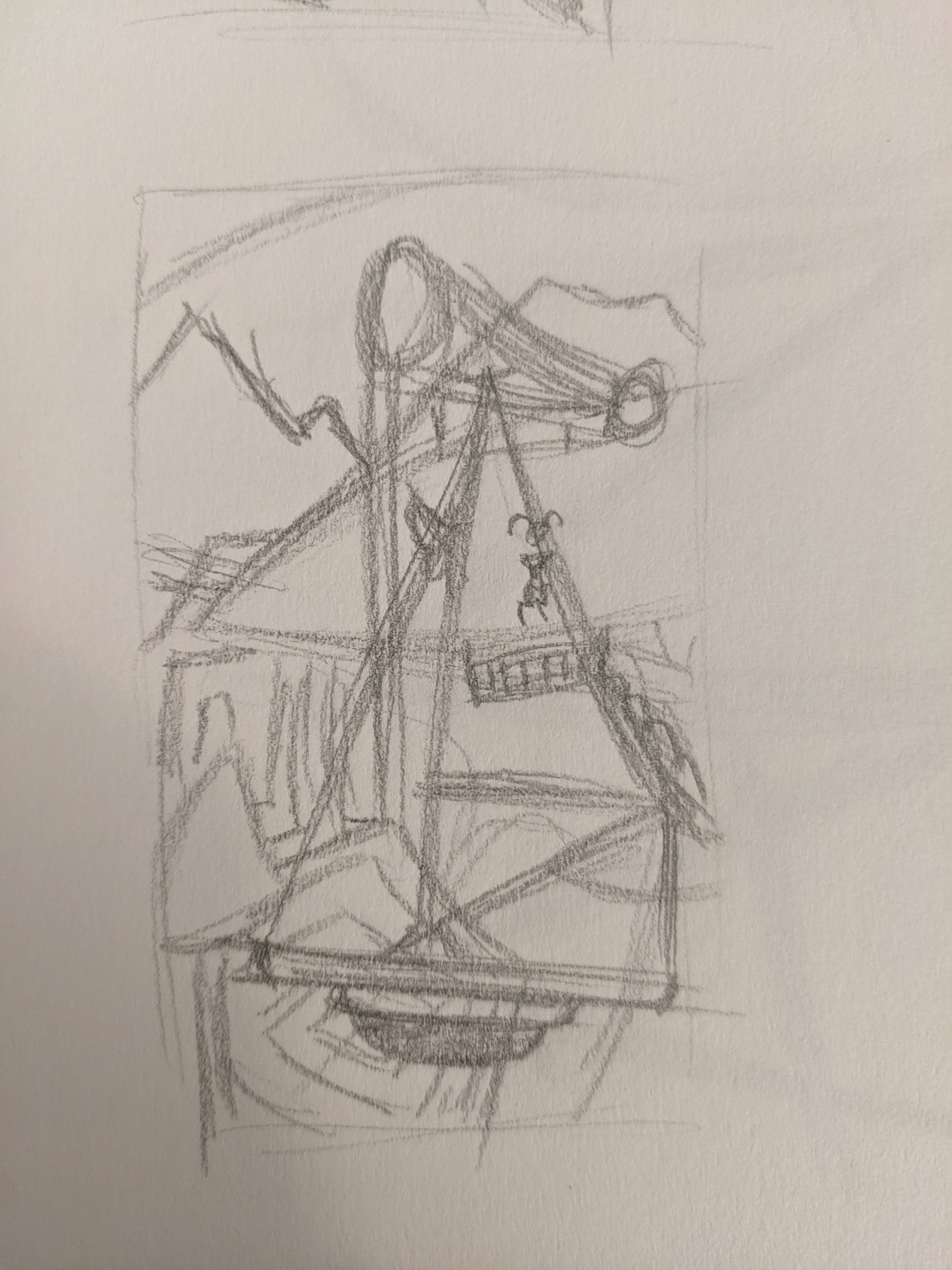
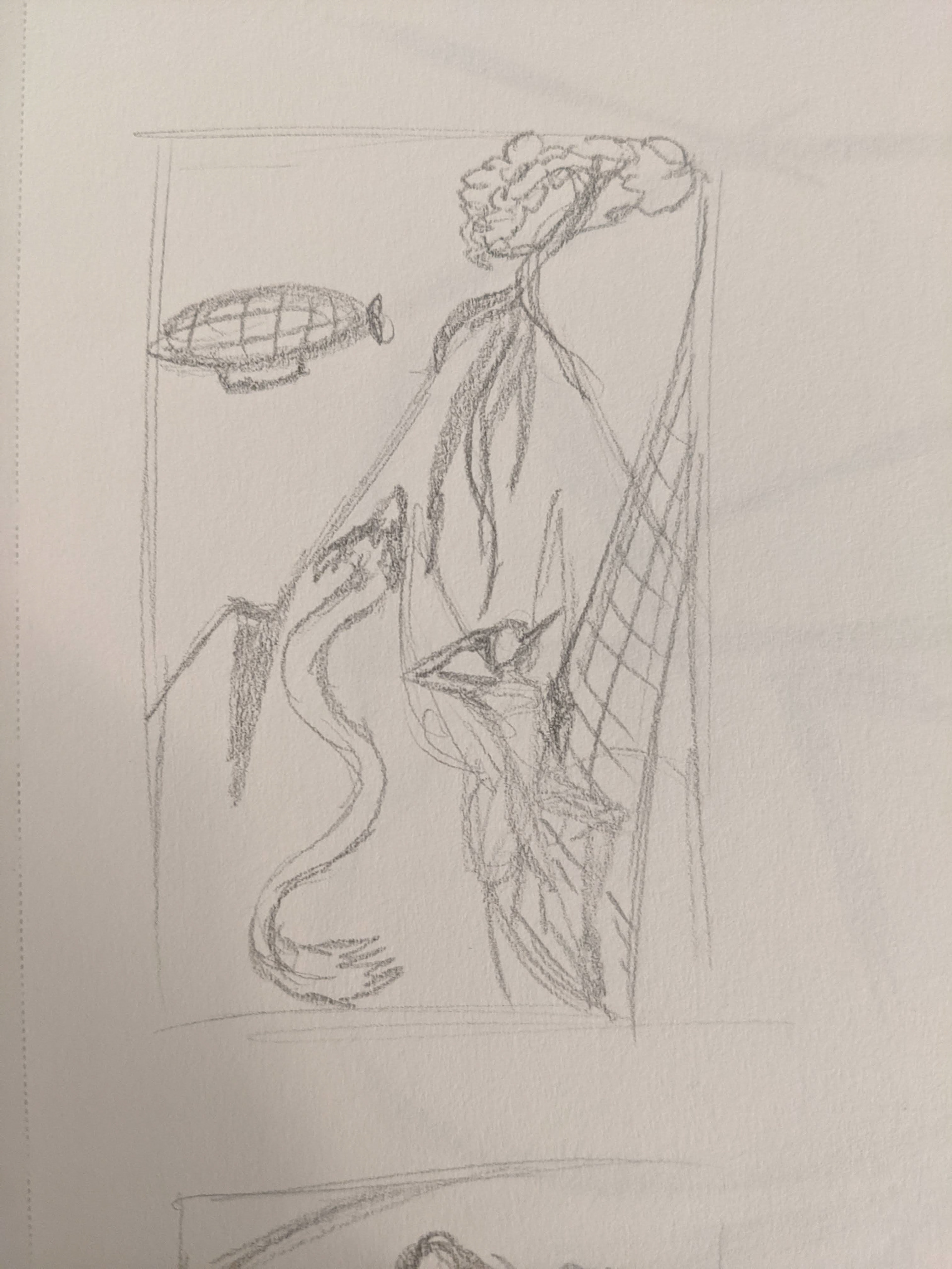
Early thumbnail sketches helped guide my vision, but ultimately didn't get used much...
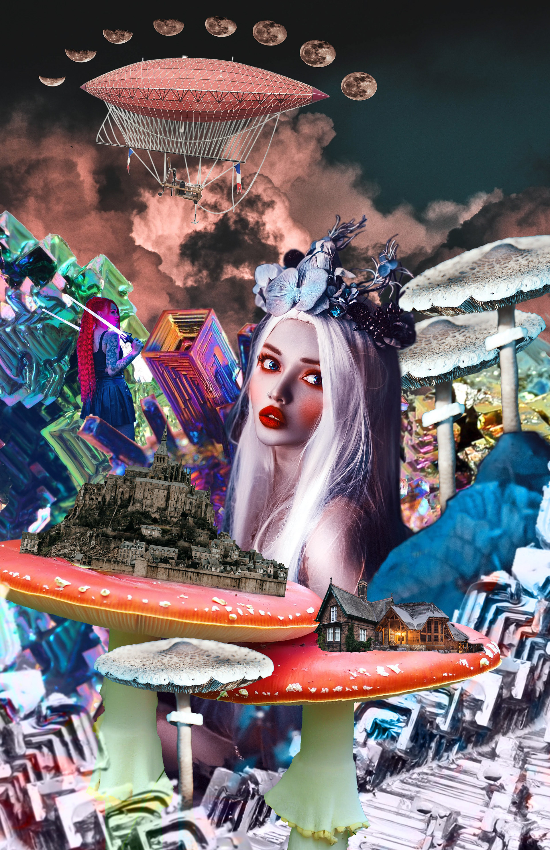
There was no particular inspiration for this, but I’d always liked the shape bismuth crystals, so I used those as the mountain ranges and went from there. Since the dice gave me the land of the fairies as part of the prompt, though, and the Feywilde is canonically a visual mess, I made it my goal to have the lower half of the collage, or “ground”, be jam-packed and difficult to look at for too long, while the top half was much calmer, to give it a chaotically organized layout that captured the internal vision I have of the fictional realm.
The Feywilde
As I mentioned earlier, I started with bismuth crystals for the mountain ranges in the very back, using their natural vibrant colors to help accent the darker blues that would make up a majority of the final piece. Once the mountains were in, I found a very regal, almost royal portrait of a figure with a flower crown, and carefully cut her out of the background, deciding she would be the main focal point in the lower half as a sort of queen of the Faywilde. I couldn’t call it the Faywilde without adding some giant mushrooms, though, so I looked up some of the more poisonous varieties and made them into platforms for some interesting buildings, including a castle. In the upper half, I made sure to keep it as simple as I could, only using a photo of a cloud at first. I felt it was too simple, though, so I found a blimp and put it up there as well, giving it a crown of moon phases to add that final touch of interest.
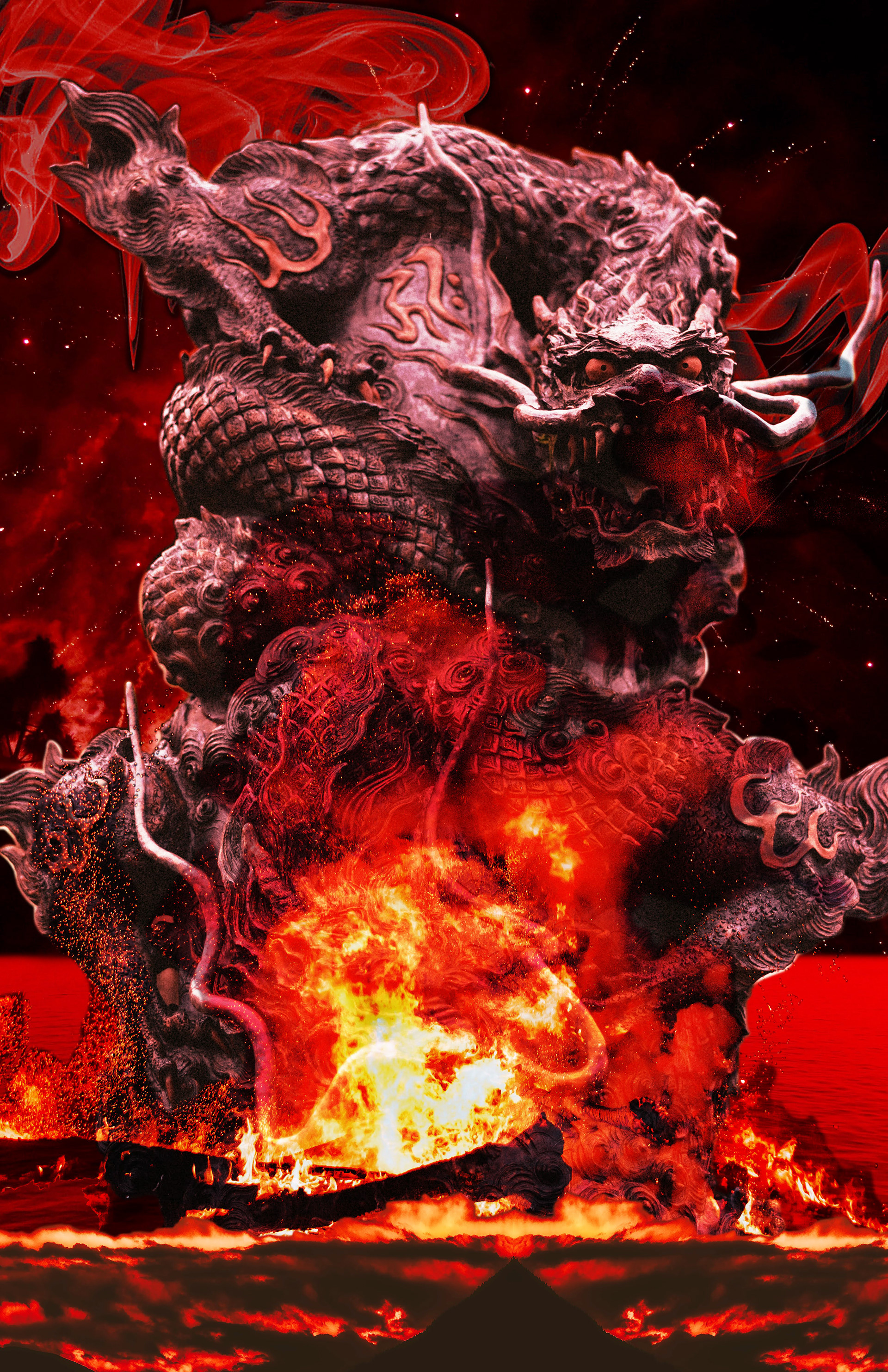
When I started this as a series, I wanted to make each part mono-chromatic to the realm, starting with the Fire Plane. I made sure to keep a deep and fiery red throughout the piece, and the end result is a dangerous-looking place that I'm okay not visiting.
This realm is known for it's constantly on-fire ground, (gee, what a shock), and the dragons that tend to roam it's burning air, so I used a combination of images depicting bonfires and forest fires to create the "ground" under the dragon statue. The smoke was added to help aid the idea that the dragon is a little toasty, and I capped it all off with a deep red overlay layer to bring all of the pieces together cohesively.
The Fire Plane
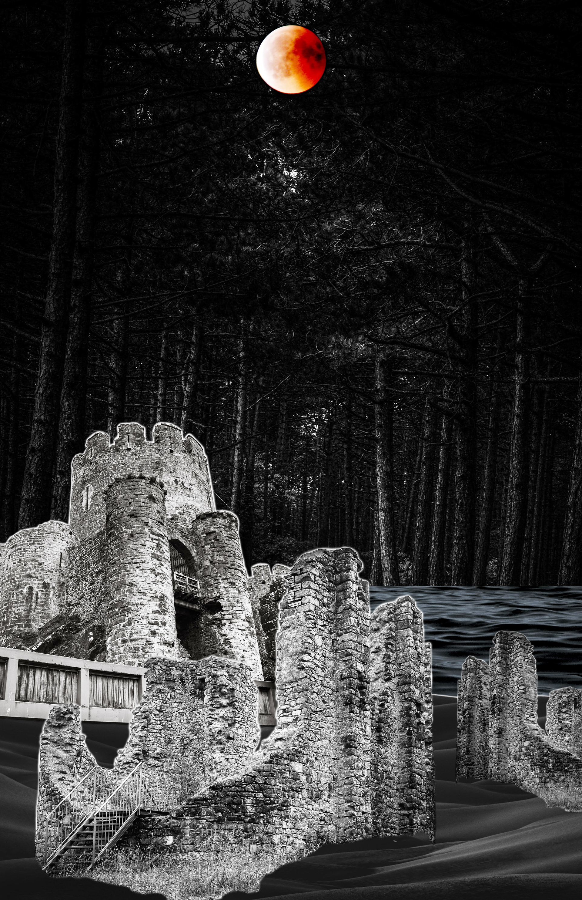
The Shadowfell plane is next in this series, and when I heard the description of it, I knew I could make it easily. Being a mirror to the material plane, (where we are right now), the Shadowfell is lightless, shadow filled, and in ruins, making it the perfect candidate for a black and white surrealist piece. This plane ended up being the most challenging for me, not because I didn't have a vision in mind or a plan to guide me, but because finding free black and white images to stick with the challenge is surprisingly hard.
I used sand dunes and water images to make up the ground, layering them over a dark forest in such a way that it almost made it seem like the forest was partially under water. Castle ruins formed the buildings along the bottom to have a buried feel, and for a single pop of color in the expanse, a blood moon hanging over it all.
The Shadowfell
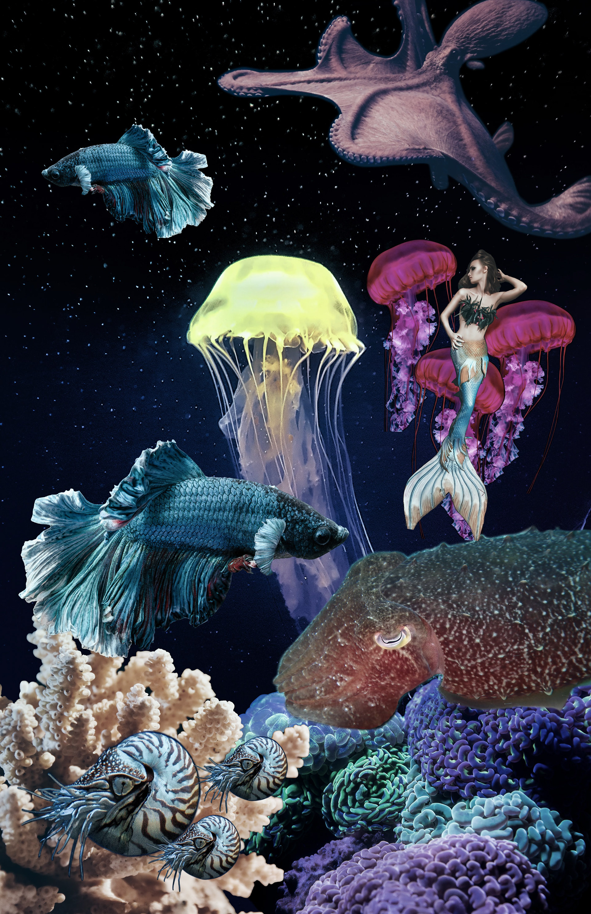
Last but not least, we have the Water Plane. An infinite expanse of water, filled with sea creatures significantly larger than you that most of the time, you can't see coming, because there's no light illuminating this place. Except for those said creatures, of course, but you usually don't want to swim near them.
As someone who loves the ocean and sea creatures in general, I had fun coming up with the layout for this one. Starting with the bottom of the image, as usual, I put down a layer of coral for the creatures to swim over. Over that, it was fair game as I began laying out all of the creatures that would be swimming through my plane. Once everything was in place, I added a blue overlay to tie it all together and make it feel more like it was under water.
The Water Plane
Altogether, this surreal series has given me a chance to showcase my Photoshop and layout skills, and I hope you enjoy it as much as I do. My personal favorite is the Water Plane, but I'm biased towards jellies.
