Pick Your Poison Winery
Challenge:
Create a fictional drink label
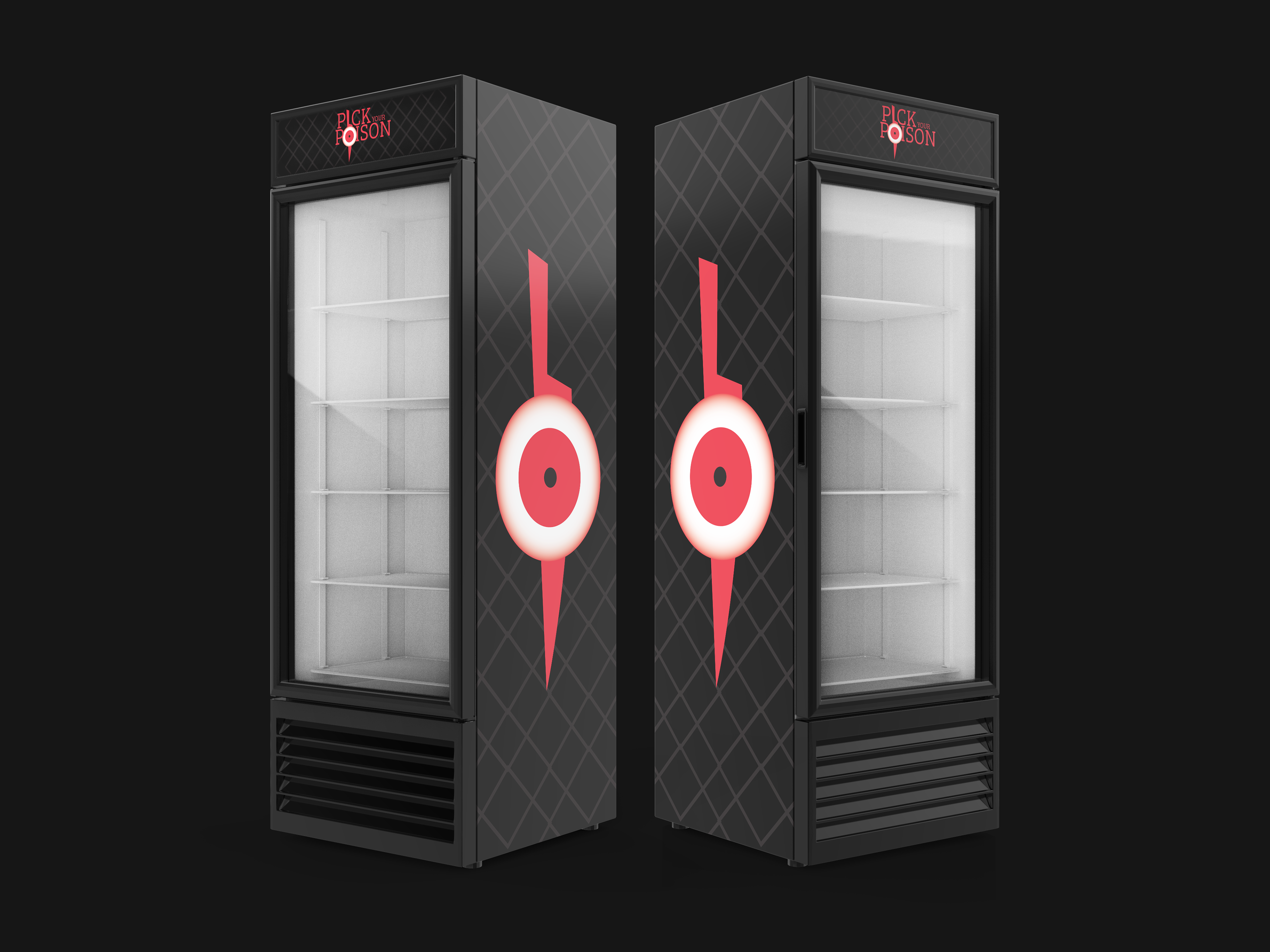
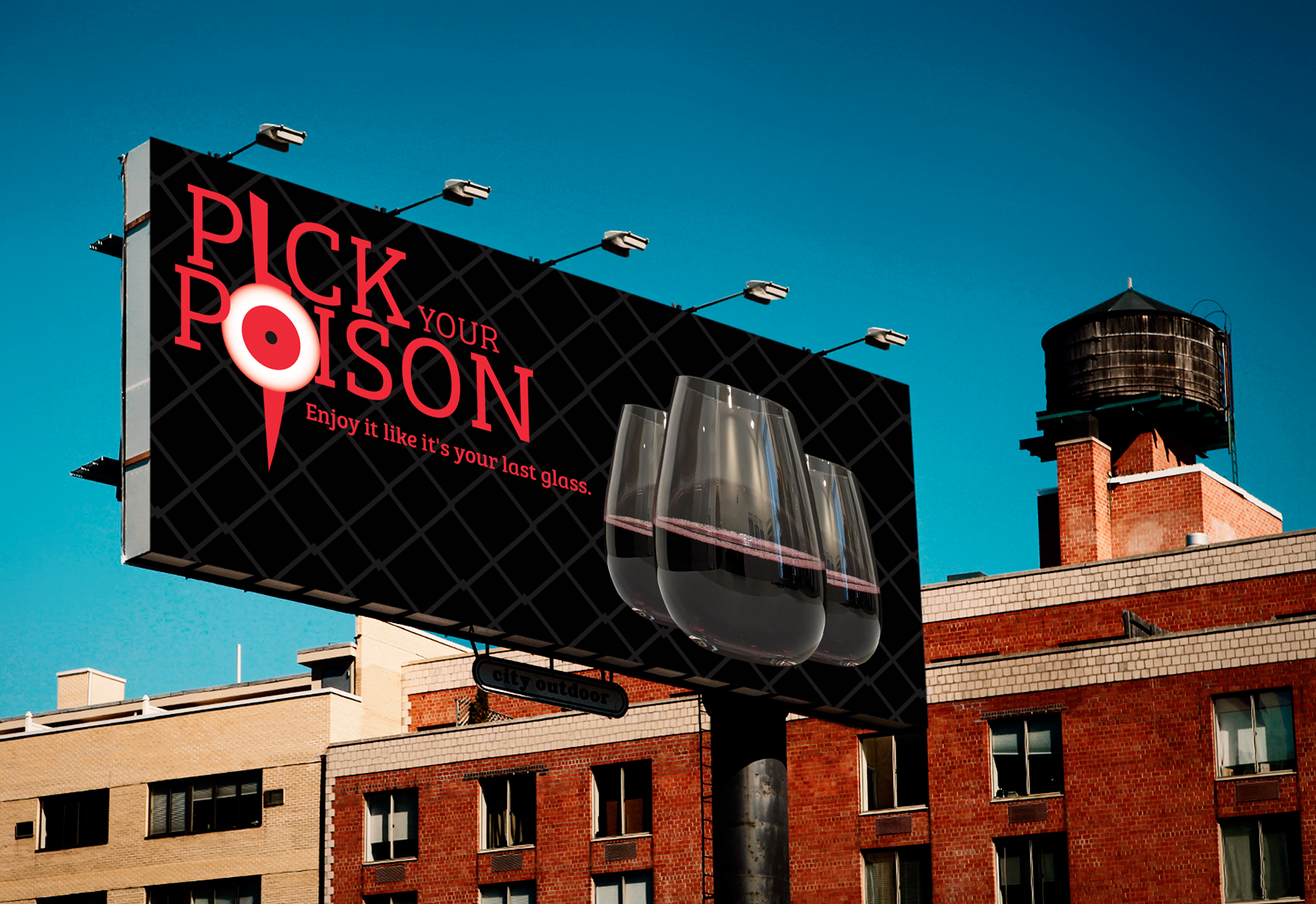
Finished drink coolers promoting Pick Your Poison
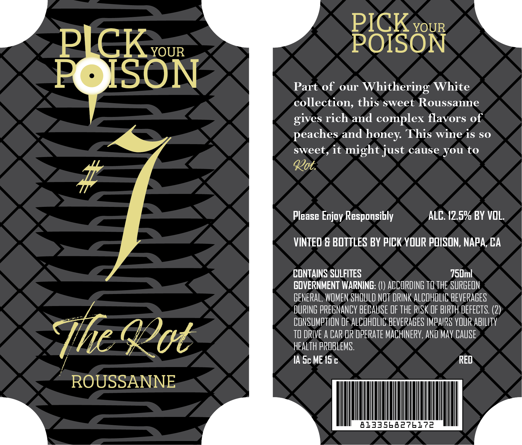
My final Packaging project involved creating a label for provided bottles or cans, and I chose the wine bottles provided, one for a red wine, and the other for a white. I wanted to make a label that was a little darker than most, as I personally see many wine companies that have either vines and grapes incorporated into their logos, or are very stylized and bright. For this project, my goal was to create a sophisticated and horror-esc brand that the goths would enjoy.
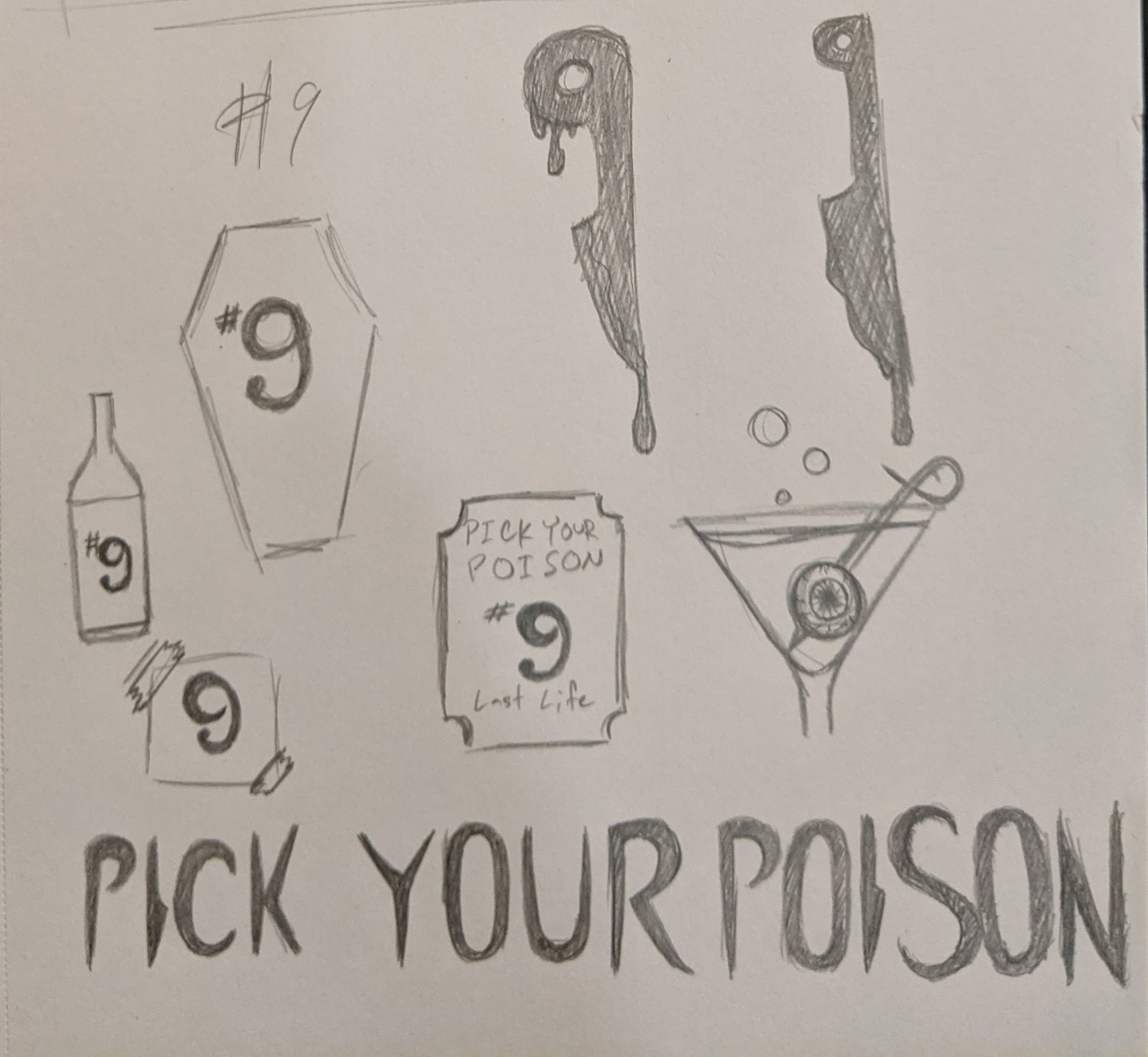
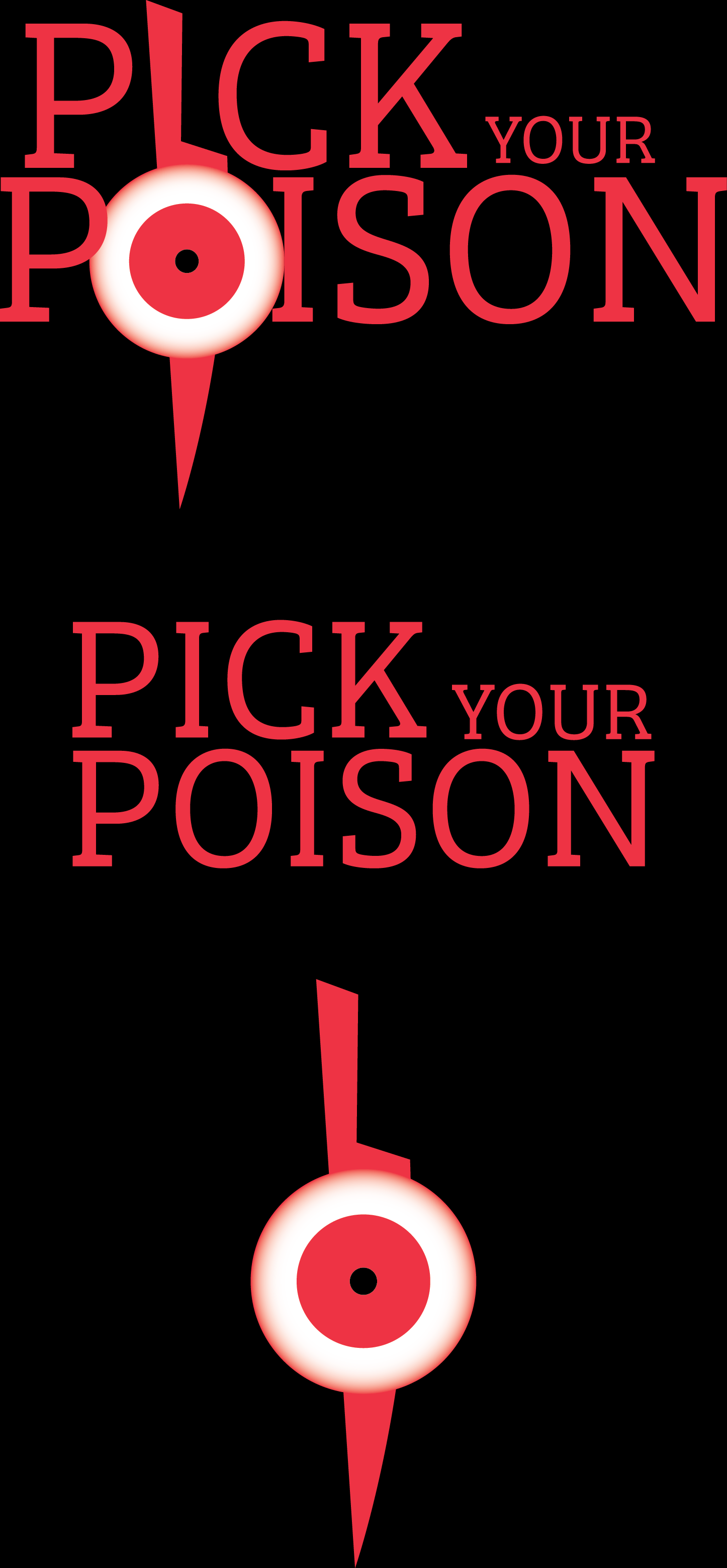
Early sketches of logo ideas and label shapes
Early on, I decided that I wanted the different varieties of wine to be numbered thanks to the music I had been listening to while working on this project. I leaned into the "poison" aspect of my project as well, settling on a classic apothecary's jar label, and got to work bringing my sketches into Adobe Illustrator.
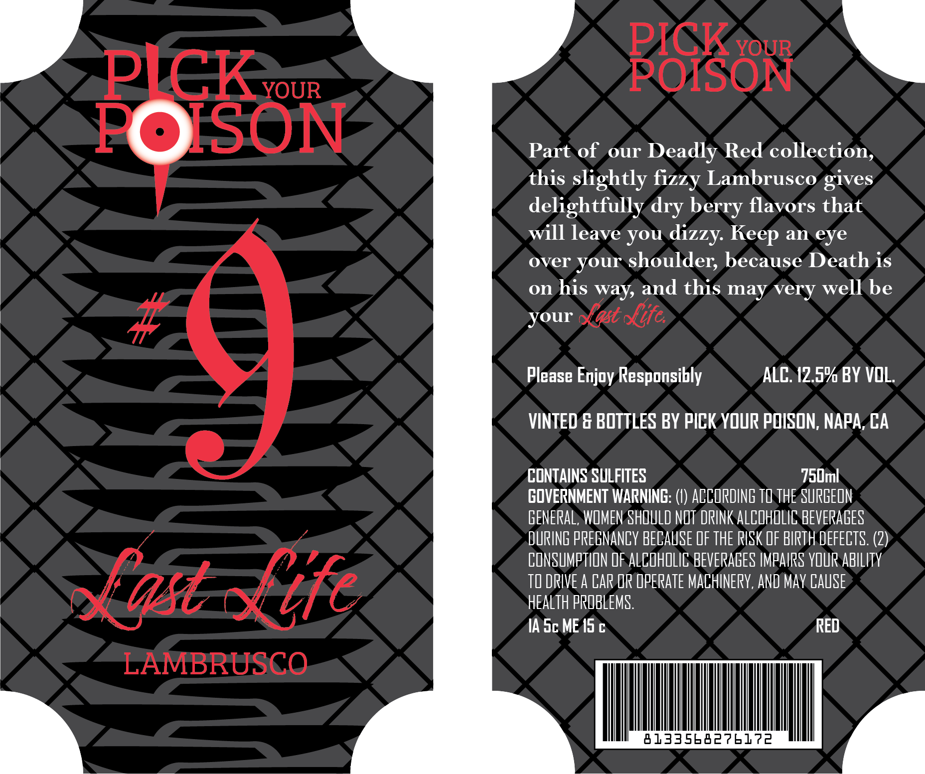

Once I had the information I needed on both the front and back of the labels, I felt it was too empty, and began playing around with patterns. My first attempt was making a crossed-knife pattern across the entire label, bit it became too cluttered, so I scrapped it and started again. I still wanted the knife motif, however, and eventually, I created a stacked knife pattern that looked very similar to the belly scales of a snake. I liked the concept and appearance of the pattern enough that I leaned into the snake pattern more, creating crosshatches that would wrap around the bottle and have the appearance of the labels printed on snake skin. Once the pattern was finished, it was easy to create the label for the white wine, as all the information I needed was already present.