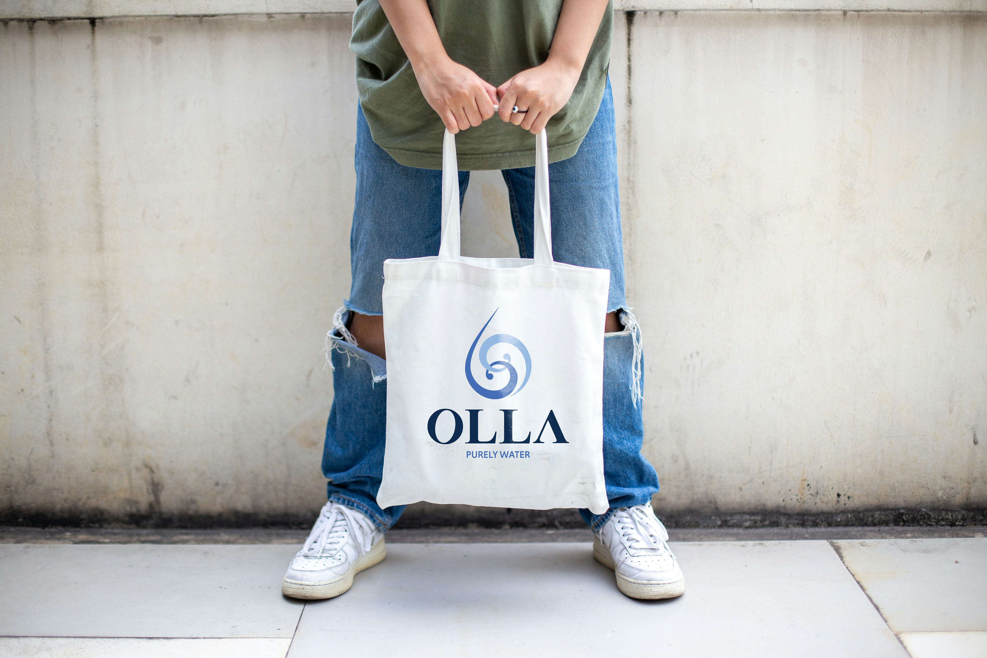
Olla Water
Challenge:
Create a new water brand for a startup water company and work in a team.
Client:
Dr. Joshua Korzenik
Alexander Posner
Daniel Posner

When my team was approached by the startup company for this project, we were handed a blank slate. They didn't have a name or a brand, and more or less told us to go wild with our initial concepts.
I struggled with this branding in the beginning, because this was the first project I had been given that had no framework to build off of. My main inspirations ended up being Liquid Death, due to their punchy and unique style, and the solar punk aesthetic, for the futuristic but natural colors and shapes.
After doing our research on current water brands, my team decided to focus on three brands as our main competitors. Boxed Water, Voss, and San Pellegrino all had aspects that this new brand wanted to embody: environmentally conscious, elegant, and healthier packaging.
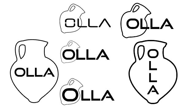
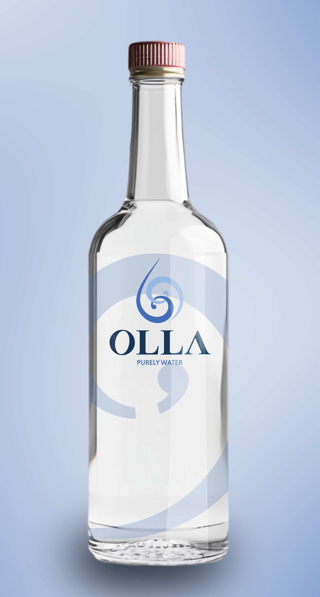
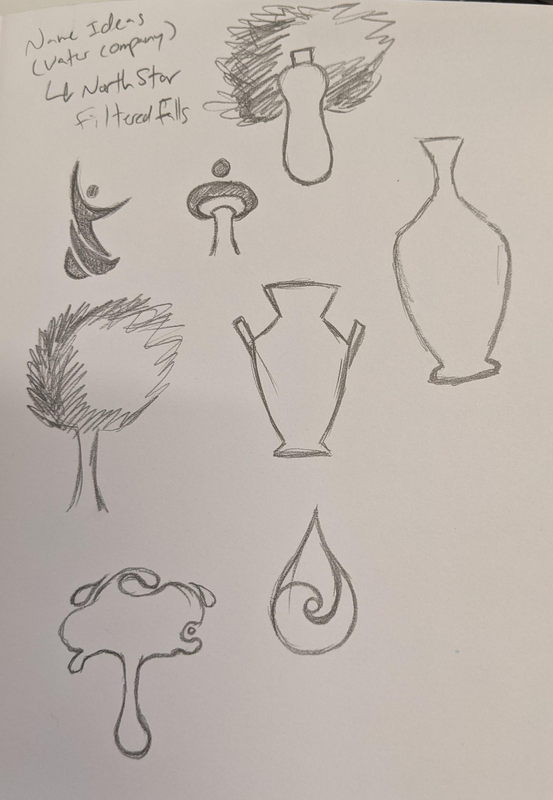
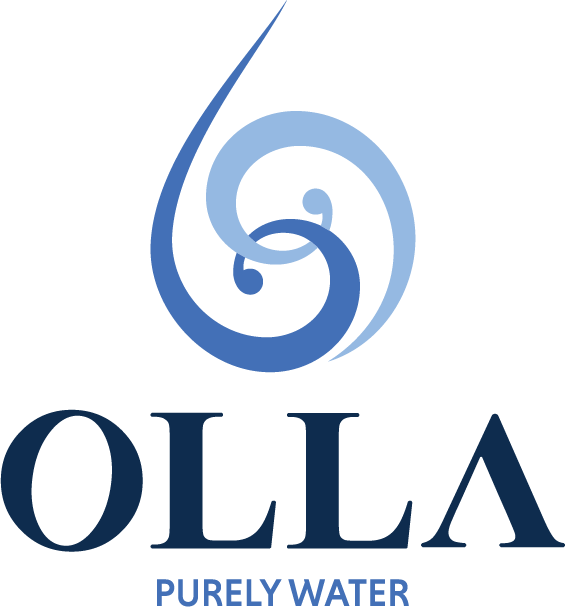
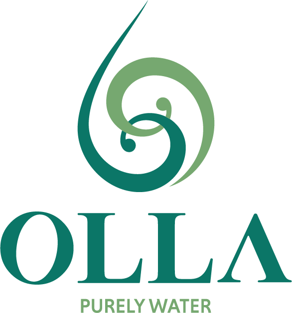
In my research for a name, I discovered Olla, the Latin word for an Ancient Roman clay water jug. After researching a bit more to make sure it wasn't an already existing brand, I decided that I would use that as the base of my design. I was still trying to make a more futuristic font work at this point, however, and I wasn't quite getting the results I was looking for. As a result, I started leaning into the Roman aspect of my inspiration, and modified Times New Roman by cutting the crossbar out of the "A" to make it look more sleek. The "O" in Olla I took from another font because it was perfectly round, and I edited the center to elongate and rotate it on an angle to give more visual interest and movement to the type as a whole.
My initial design focused heavily on elegance and simplicity. I wanted it to be a high-end brand, due to the initial cost estimate that glass bottles, their packaging of choice, would cost. I still wanted movement in the icon, to help inspire that feeling of running water, and after presenting all of the concept designs to the clients, they agreed to use my design as the base, while taking elements of my other team members' iterations to add to the mix.
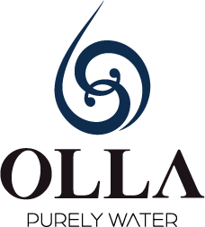
The clients also wanted the tagline to be changed to "The Cleanest Water On Earth", but after more conversation and deliberation, they eventually changed it back to "Purely Water".
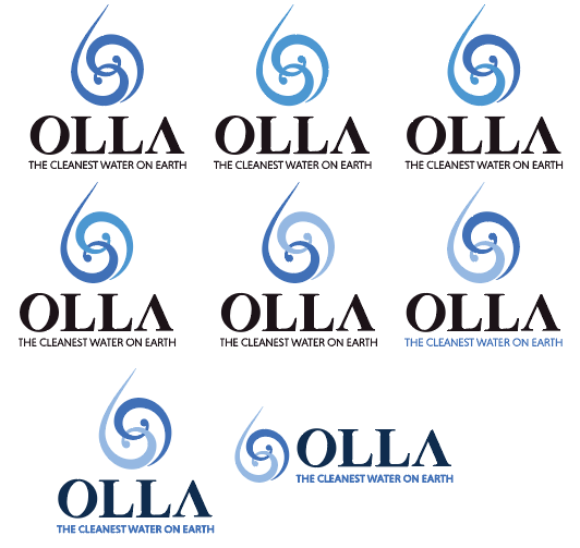
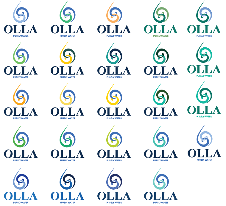
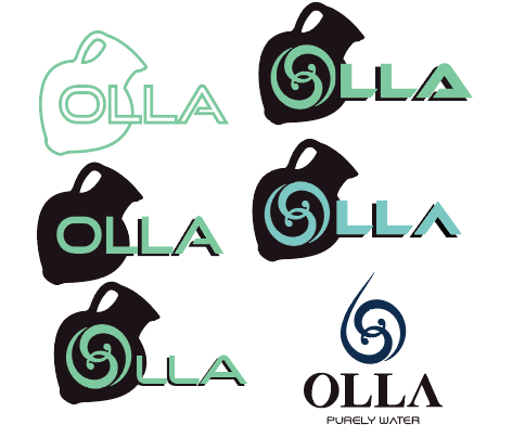
After receiving the feedback from the clients, I began exploring how the color palette could be used in my design. I split the spiral icon in two, having them hook into each other, and tried mixing tints of a lighter and darker cerulean blue, aiding the movement and image of moving water.
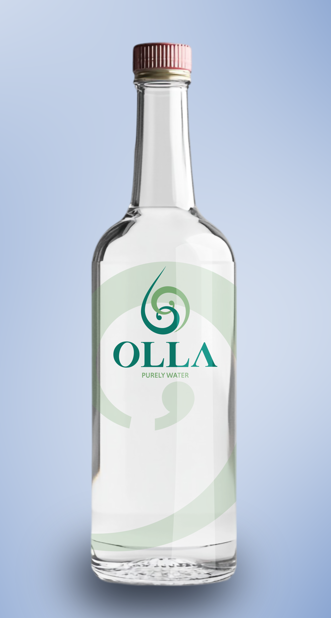
My team and I were told to explore other color options as well, so I started leaning more into the green hues, as a green color palette would not only help this brand stand out on a shelf, it would help inspire connections to nature, and how plants filter water out of the ground through their roots.
For the label design, I wanted to lean into transparency for the brand, and mocked up a clear logo that would allow the consumer to see clearly into the bottle. I used the upper swirl of the logo icon and lowered the opacity to a watermark, allowing you to see through to the bottle underneath.
This project is currently ongoing, but my logo concepts as of current can go down two paths: the blue color palette will provide instant recognition as water, and the green will stand out against current brands as a more unique take on the bottled water industry. I hope to continue working with these clients and expanding on this brand, and maybe someday soon, even see this brand on the shelves at my local grocery.