Jolly Rodger's Paddling
Challenge:
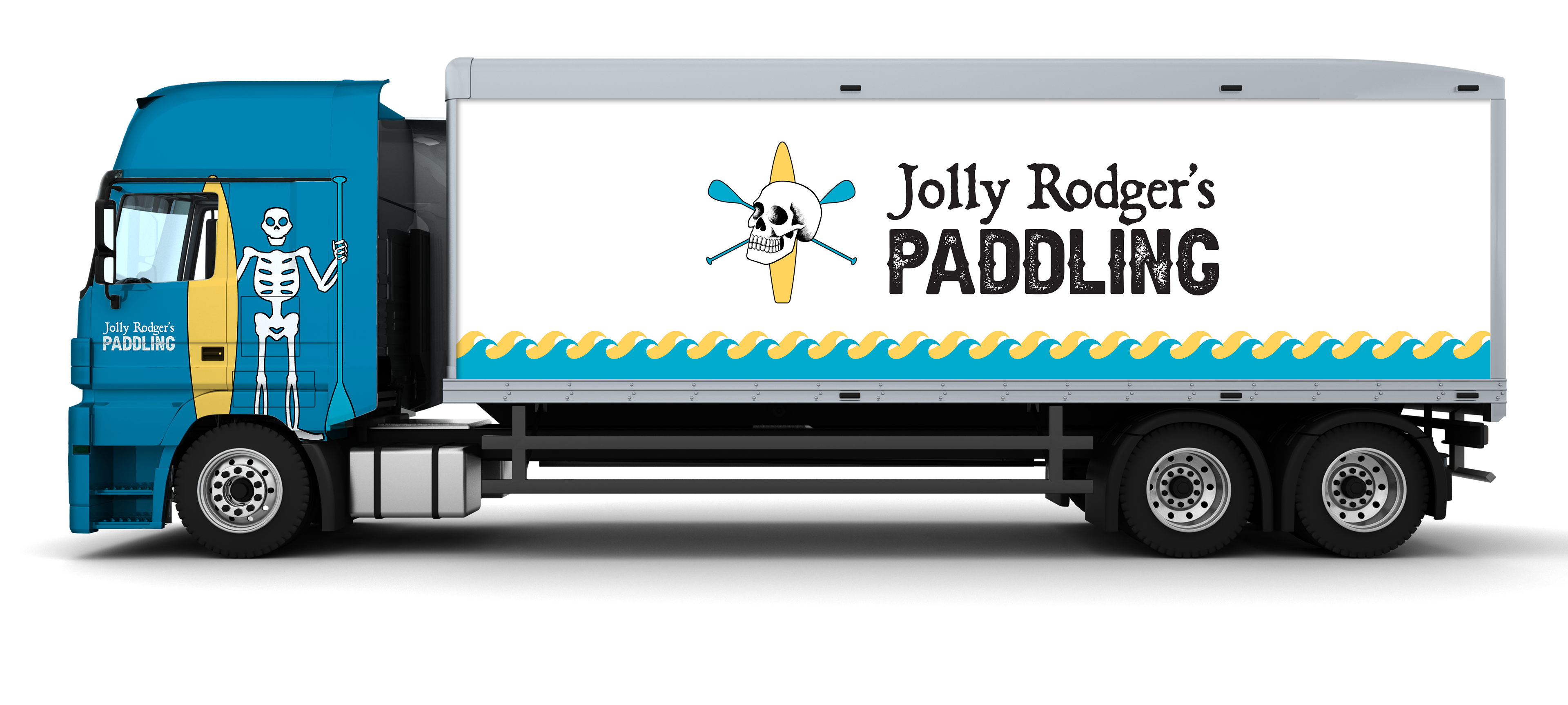
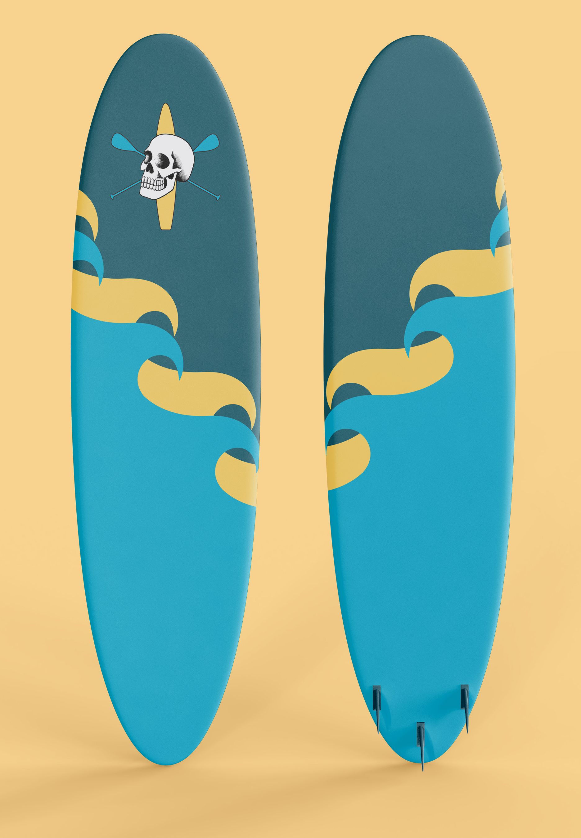
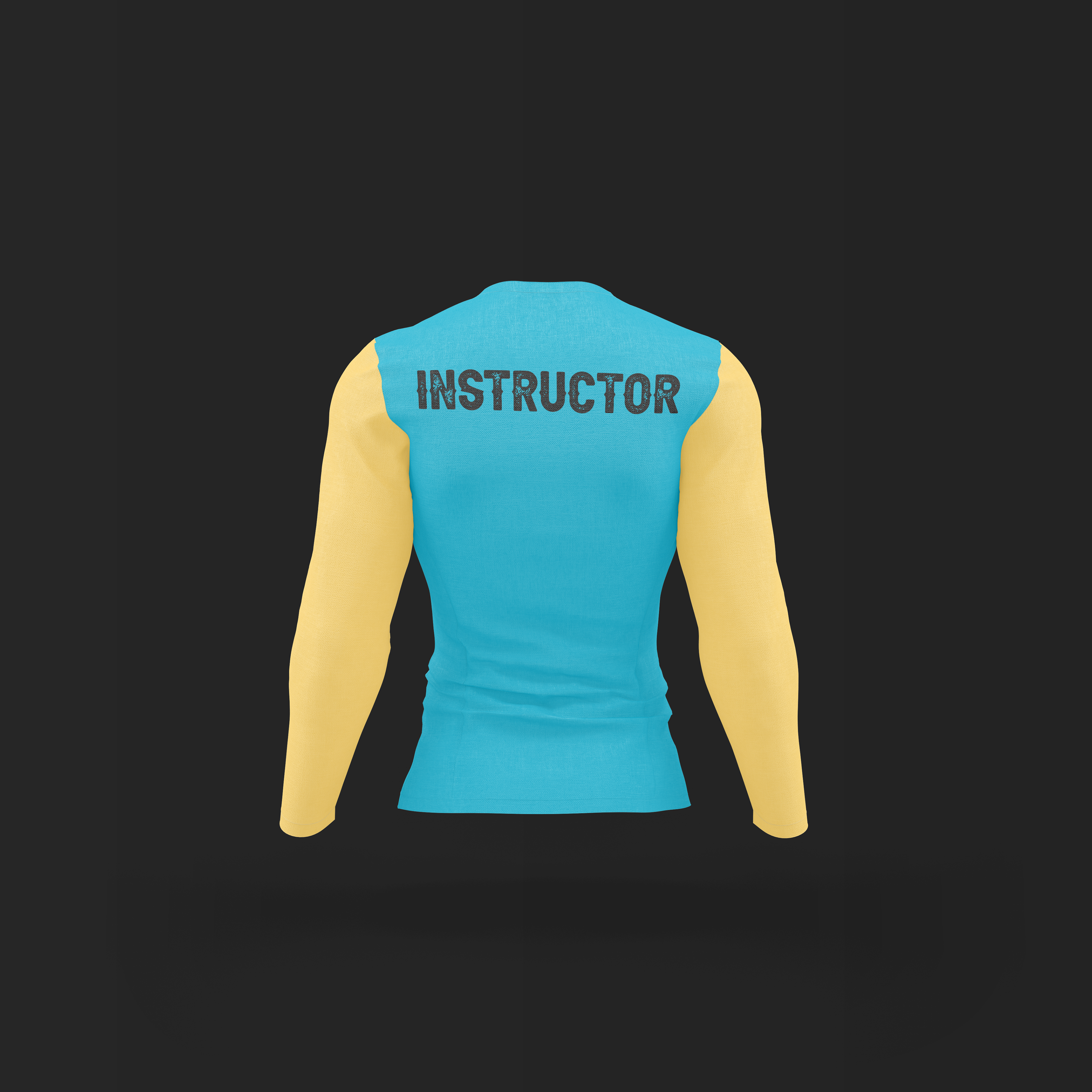
Create merch, vehicle wraps, and uniforms for a fictional brand

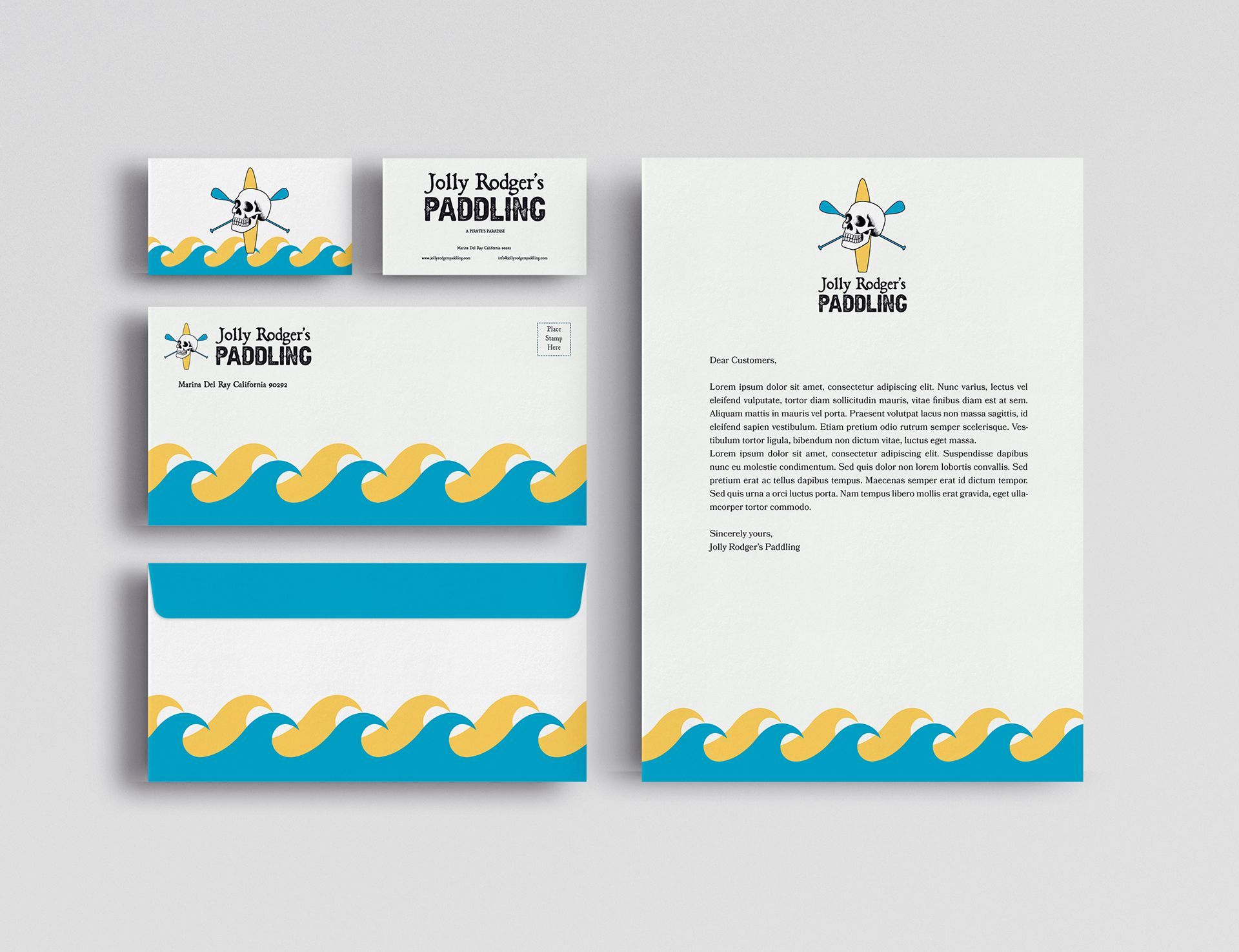
The finished stationary
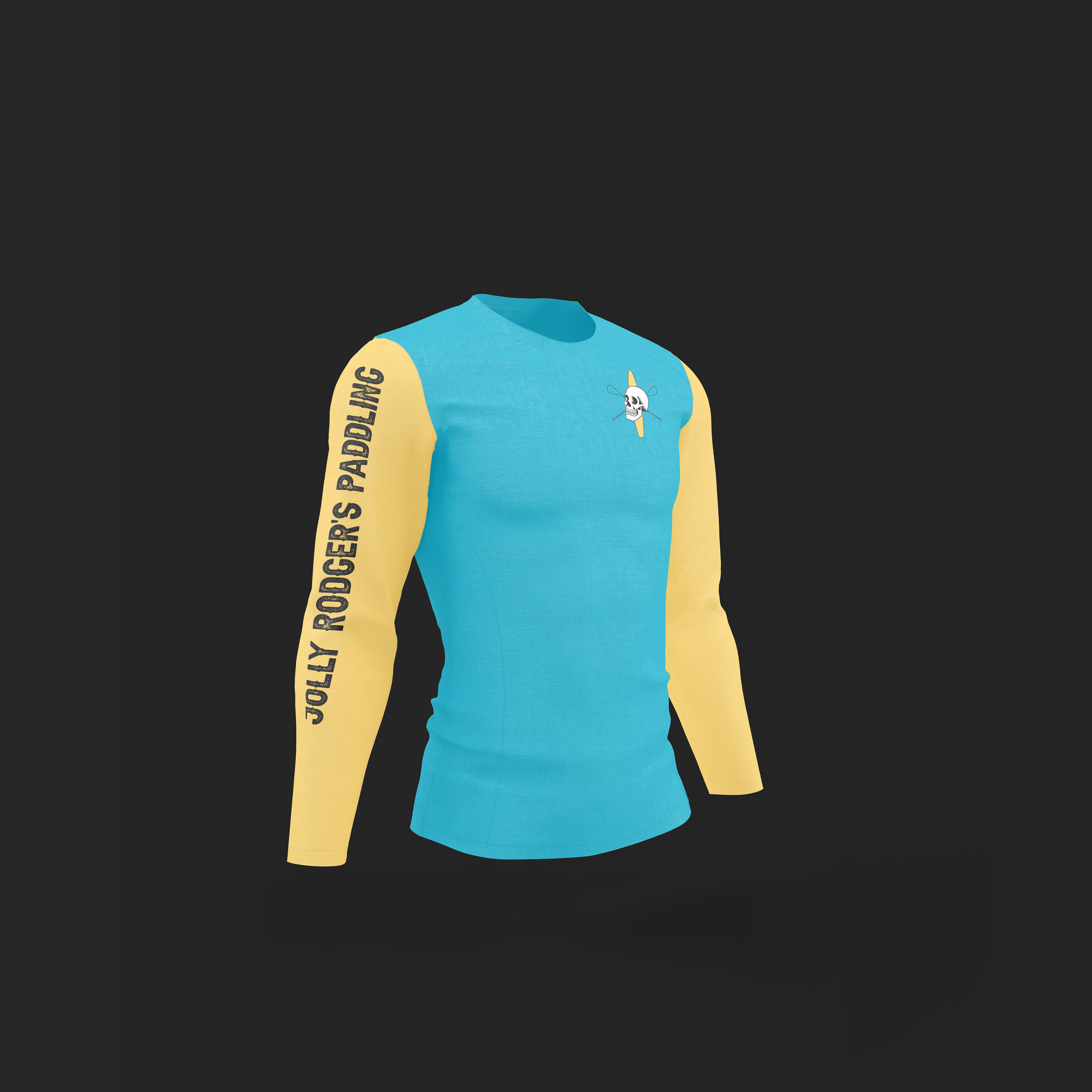
For my final project in my Branding class, my professor tasked the class with making a brand from scratch, complete with merchandise, vehicle wraps, and uniforms. I chose to make a paddle boarding company, as I go to the beach every summer in California and paddle board with family, and I've never worked on a sports company before.
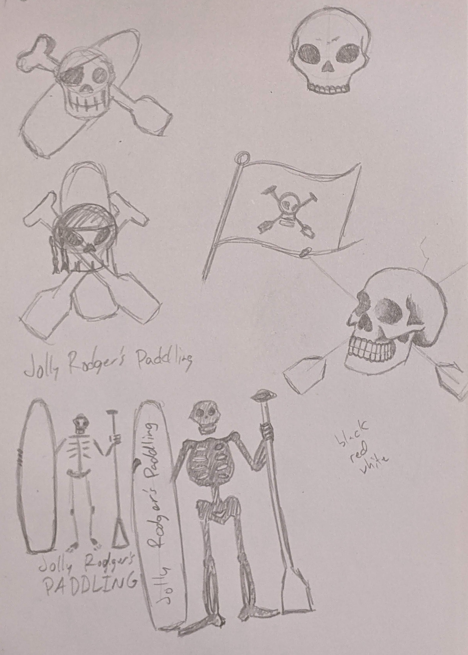
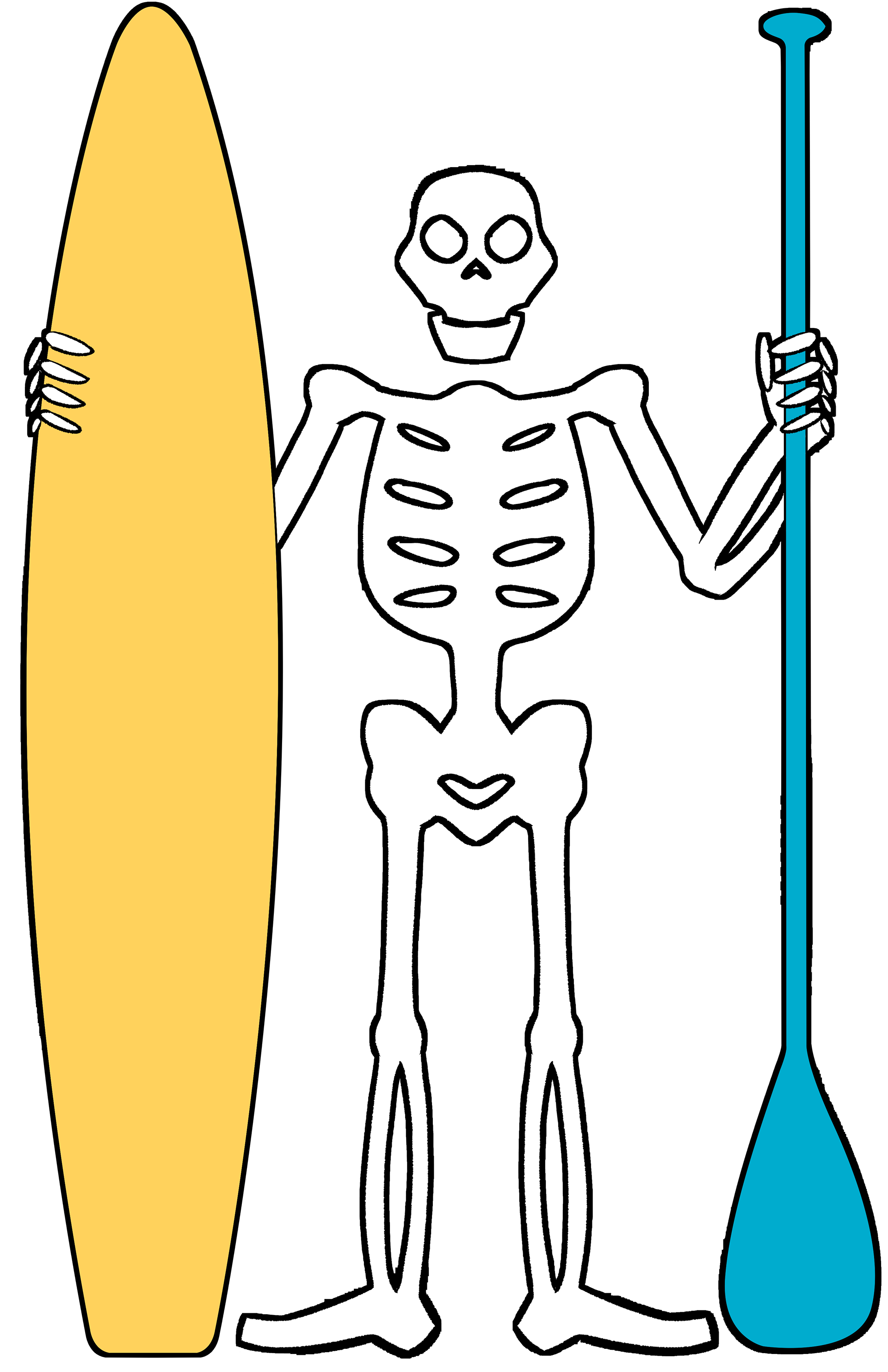
Early concept sketches of the logo
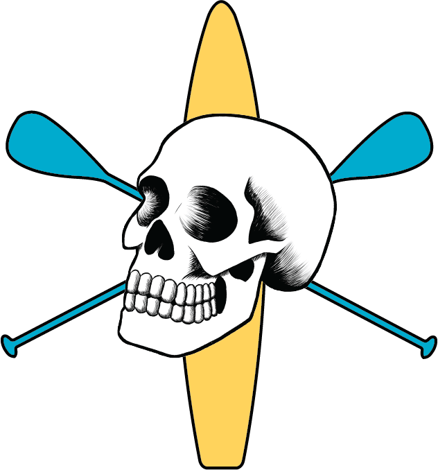
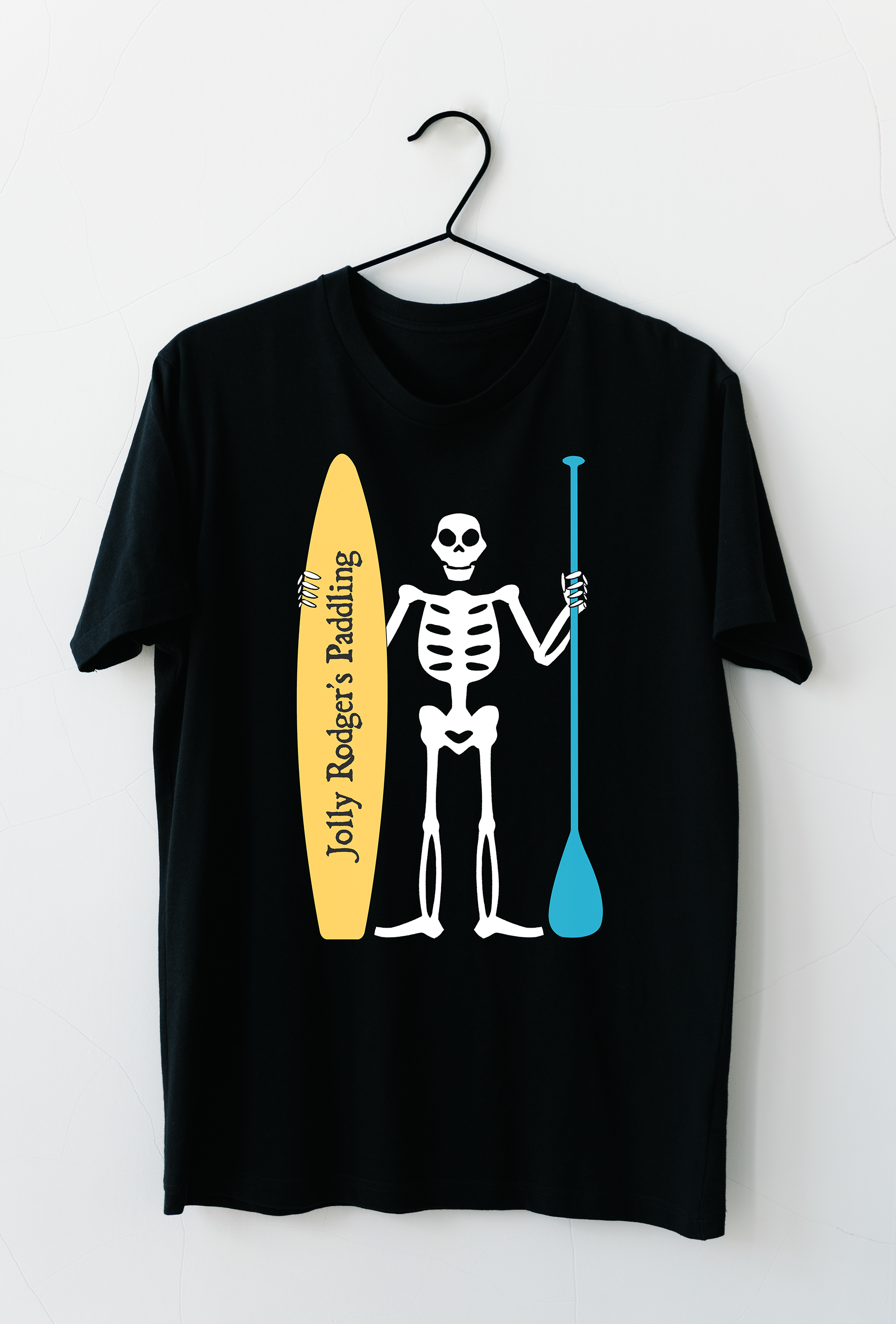
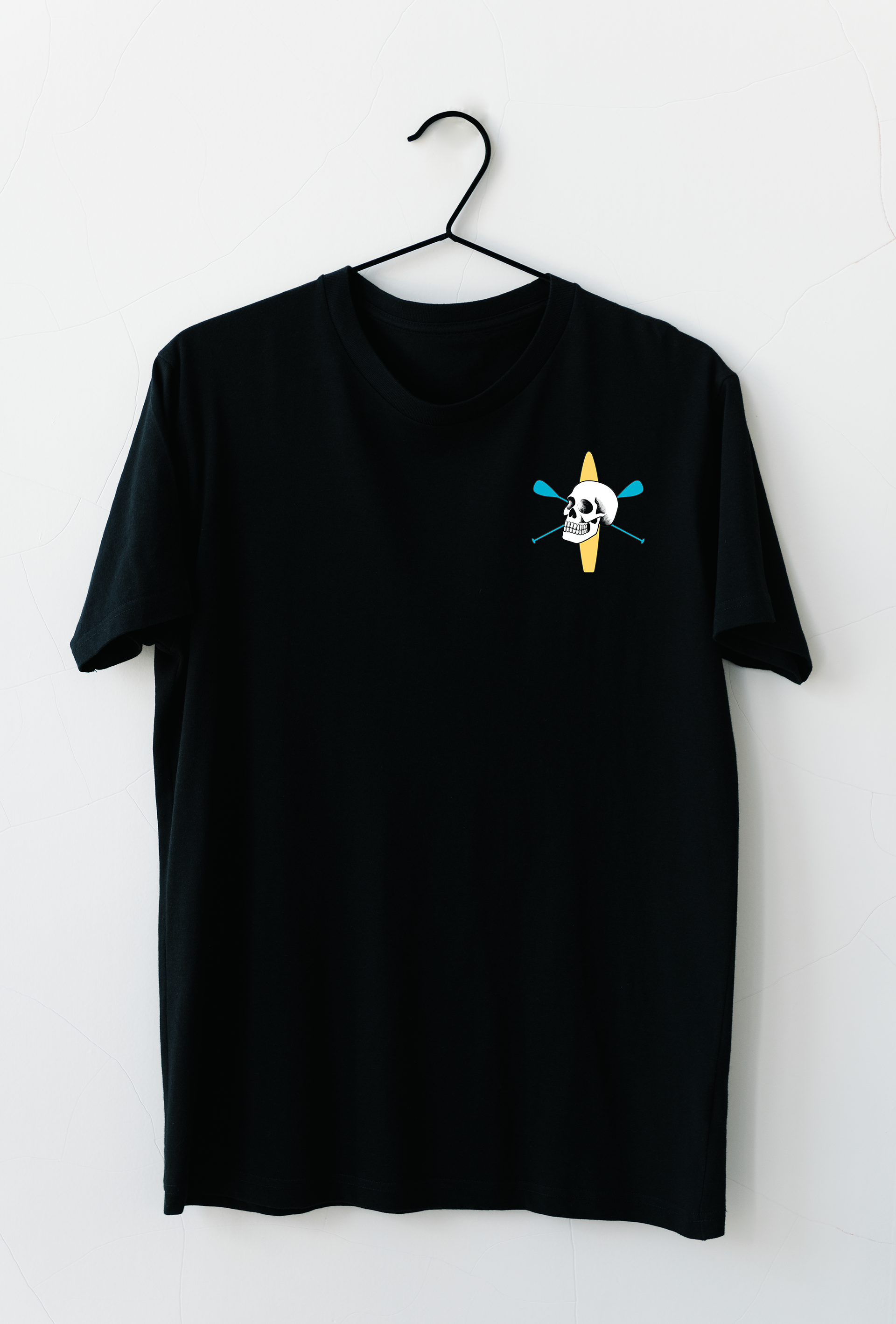
My main inspiration for the logo of this company was obviously the classic pirate flags everyone is familiar with. I eventually settled on Edward Low's flag, the full skeleton on a black background, and the classic skull and crossbones as the two styles I wanted for my branding. I changed the crossbones for paddles, and added a paddle board behind the skull to make it clear this was a paddle boarding company, then moved on to font choices. I wanted to make the typography of the logo distinctly "pirate-y", and I eventually found a gem of a font named BlackBeard on Adobe Fonts, and paired it with a much blockier, stamp font called Aldivaro.
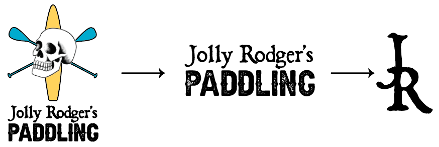
Responsive logo getting progressively smaller for use on items with less space
My original intention for the colors were to be red, white, and black, like the old pirate flags, but after some critique from both my professor and my peers, I decided to change directions and go for a brighter, more welcoming palette, with a bright yellow for the board and teal for the crossed paddles. I think this switch was a great improvement to my original concept, as the red on black would vibrate no matter how much I adjusted the shade of red I was using.